Metric Insights provides the ability to compare a Metric to other different Metrics in order to spot any emerging trends and review the results of various events.
This article provides an overview of this feature, with links to provide more detail as needed.
1. Accessing Metric Overlays
Open the Metric Viewer by opening the Metric Editor and clicking [View].
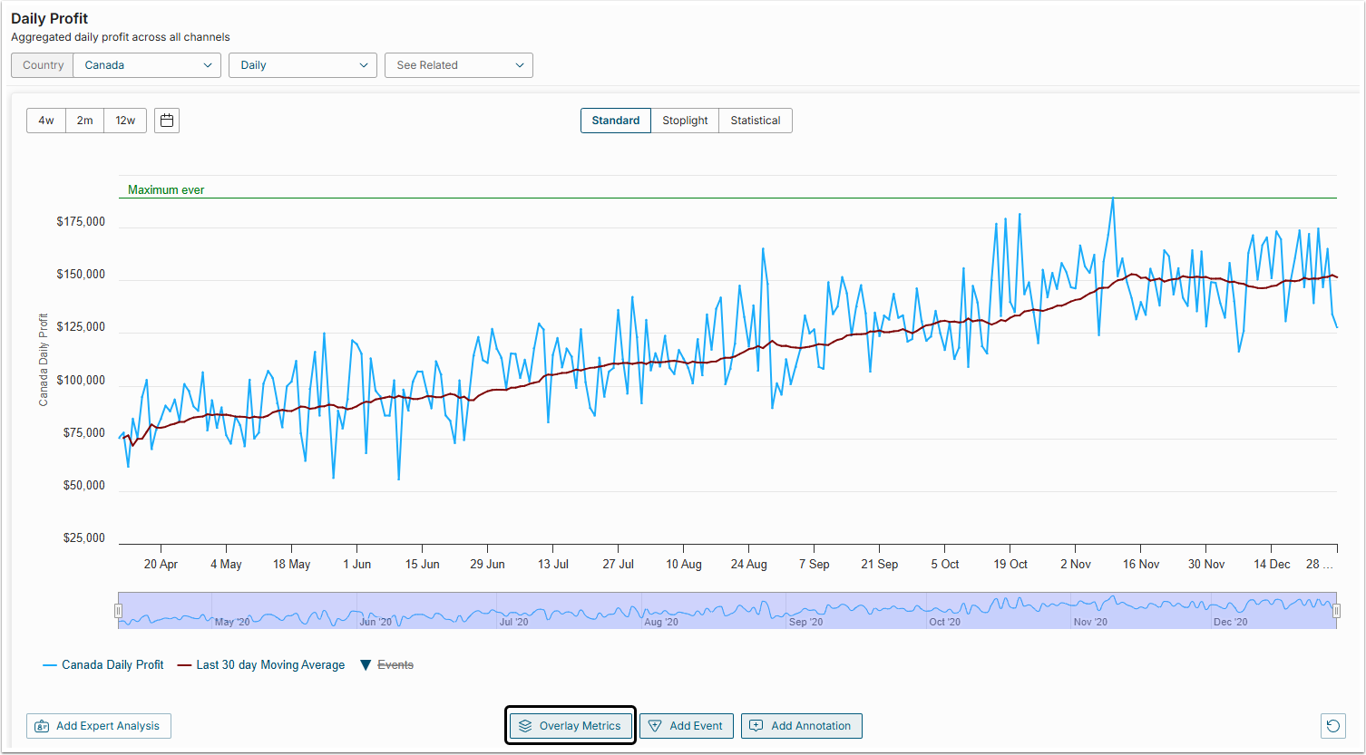
To add an overlay Metric to your Chart, click [Overlay Metrics] below the Legend of this Chart. The Overlay Metrics pop-up opens.
2. Adding Overlay Metrics
At the Add Overlay Metrics screen you can select one or several Metrics to be added to your original Metric.
NOTE: Only Metrics of the same measurement interval can be added to your original Metric (Daily, Monthly, etc.)
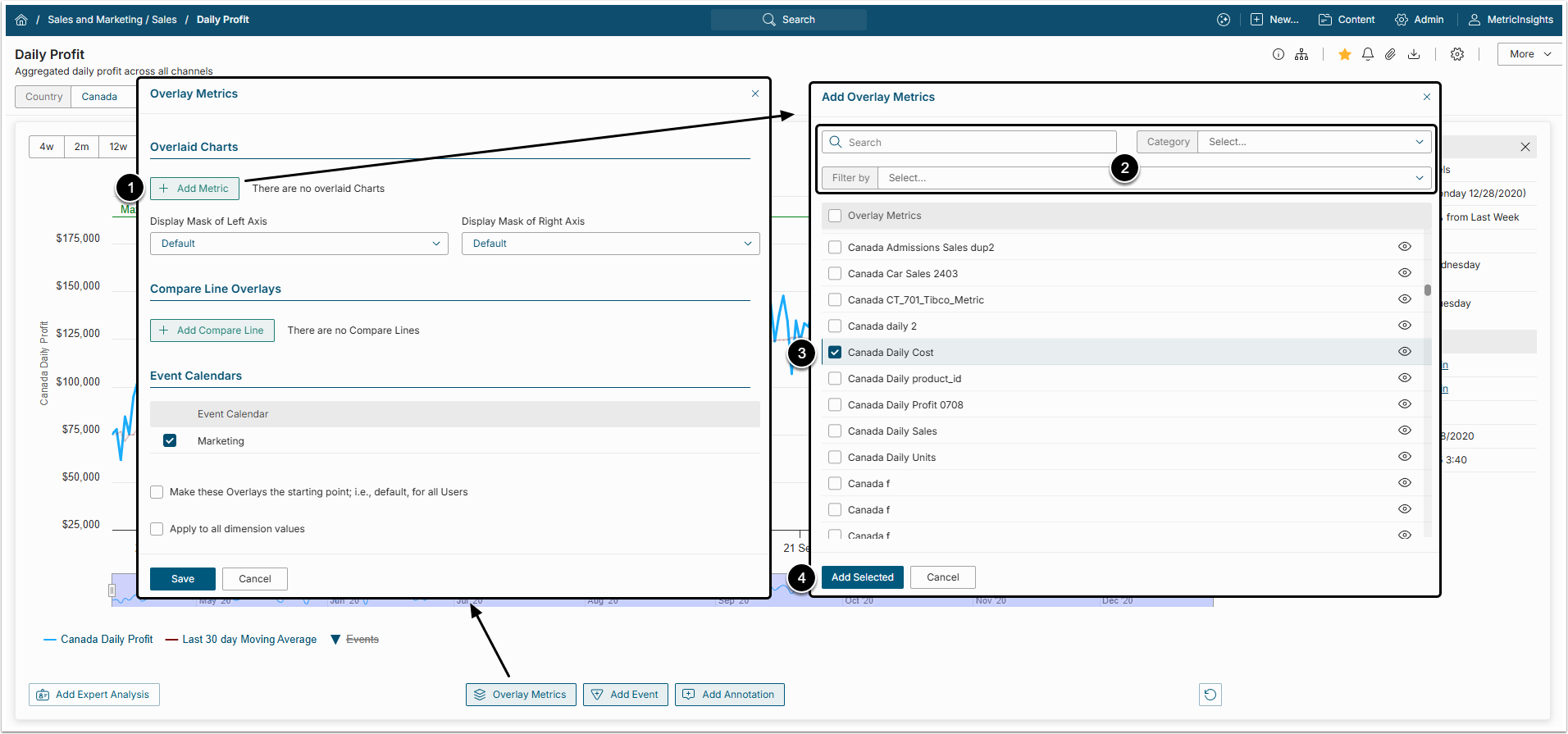
To add overlay Metrics, perform the following steps:
- [+ Add Metric] to open the Add Overlay Metric pop-up.
- Search for the required Metric by typing its name into the Search bar or filter the list using Category and Filter by filters.
- Select the checkboxes of the required Charts to add them to the original Chart.
- Click [Add Selected] to overlay the original Metric with selected ones.
After that the overlaid Metric will be shown in the Overlaid Charts grid on the Overlay Metric window.
2.1. Editing Overlay Metrics
To edit the Overlay Chart design, click the gear icon for the corresponding Metric. The Overlay options window opens.
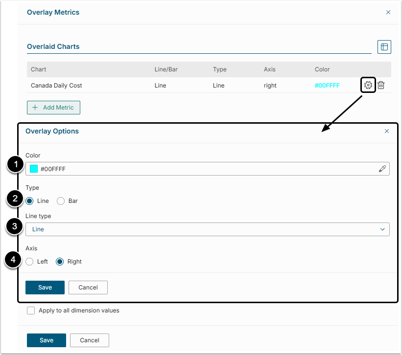
- Color: If several charts are laid over the original one, every additional Metric is going to be of its own color. To change the color of the Metric's line, click the eyedropper button to the right of the Color field and single-click a new color from the palette to select it.
- Type: Select how the chart to be displayed.
- Line Type: This field is shown only if "line" value is selected in the field above. The line of the Overlay Metric can be dashed, dotted, etc. Select different line types for different overlay charts.
- Axis: It is recommended to place the Axis of the Overlay Chart on the right side of the original chart.
Click [Save] to keep the changes made.
2.2. Display Masks of Left and Right Axis
In the example above we have added Monthly COGS for wine accessory chart to the original Monthly COGS for wine chart. The Monthly COGS for wine accessory chart is shown as a dotted line and its Axis is displayed to the right of the chart.
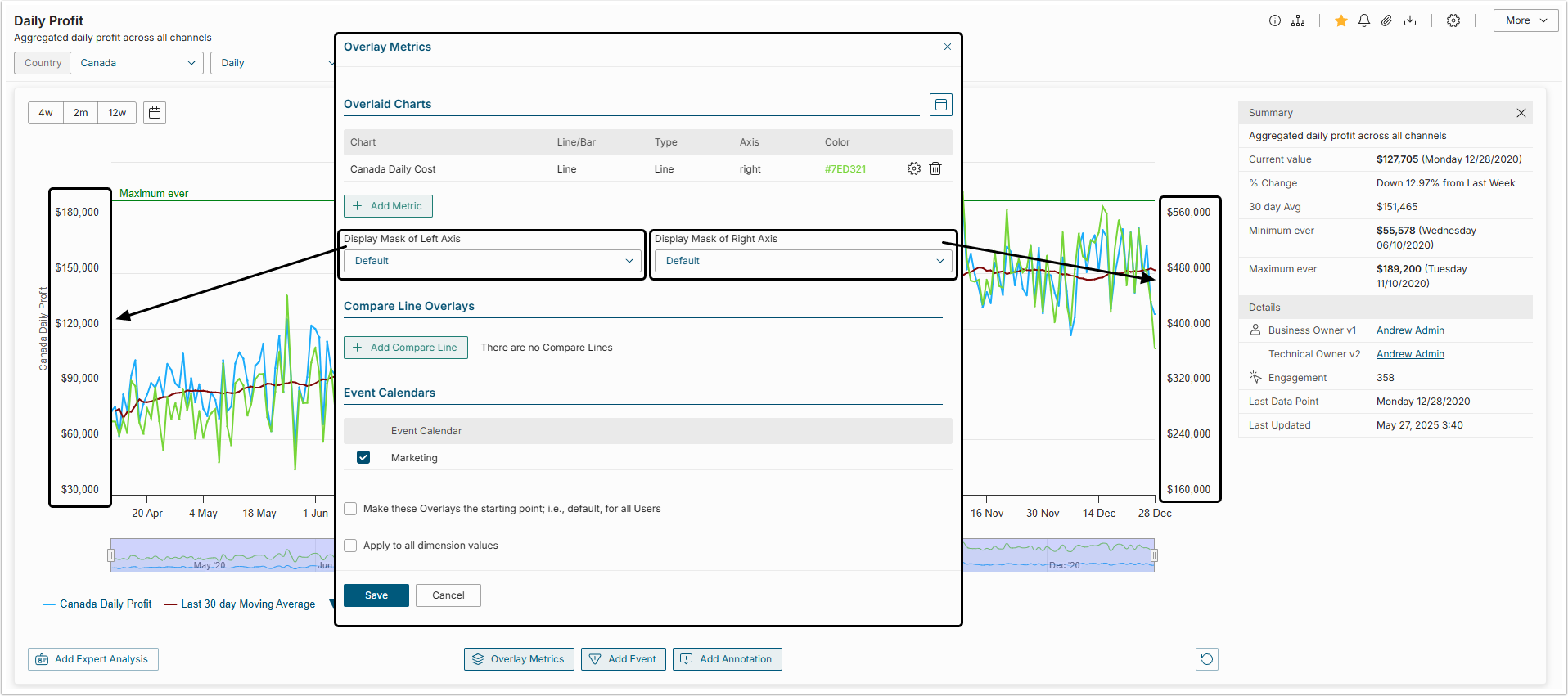
NOTE: To hide the Overlay Chart, single-click its Legend below the chart. When the Overlay Chart is hidden, its Legend is shaded.
3. Adding Compare Lines to your Metric
Compare Lines can be added to analyze current Metric and the same Metric at some point in the past.
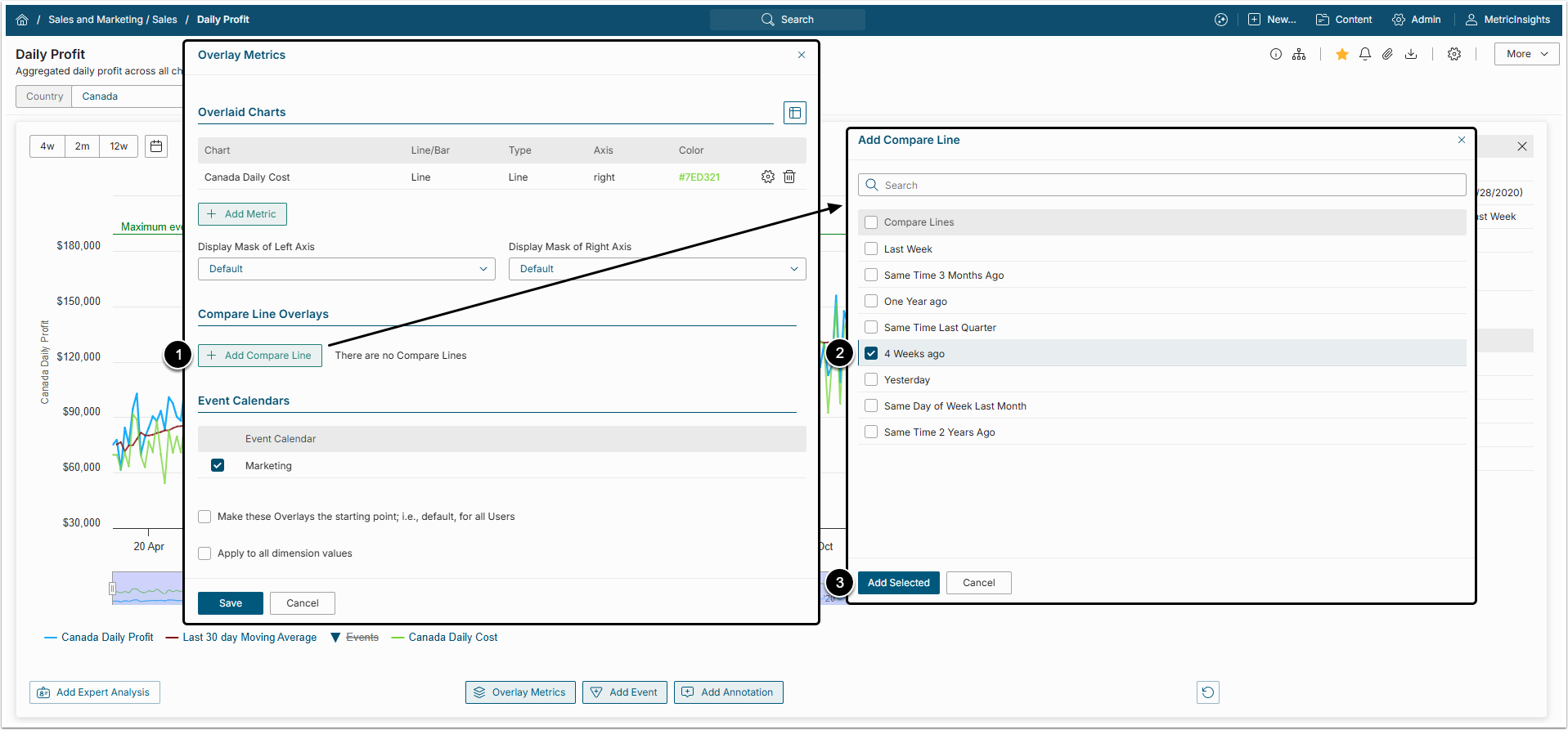
- [+ Add Compare Line] to open the Add Compare Line pop-up.
- Select the checkboxes for one or several time periods in the list.
- Click [Add Selected] to add Compare Lines to the original Chart.
3.1. Editing Compare Lines
The design of a Compare Line can be changed by clicking on the gear icon in the Compare Line overlays grid of the Overlay Metrics window.
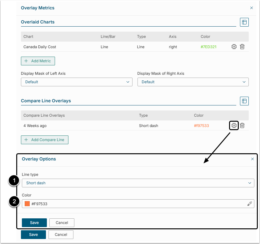
- Line Type: Compare Lines can be dashed, dotted, etc. Select different Line types for different Compare Lines.
- Color: If several Compare Lines are laid over the original Chart, they are usually of the same color. To change the color of the Compare Line, click the eyedropper button to the right of the Color field and single-click a new color from the palette to select it.
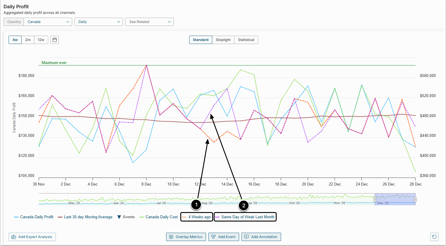
In the example above you can see a Chart with two Compare lines:
- 4 Weeks ago
- Same Day of Week Last Month
NOTE: To hide the Compare Line, single-click its Legend below the chart. When the Compare Line is hidden, its Legend is shaded.
4. Associated Event Calendars
Events from different Event Calendars are usually shown in different colors.
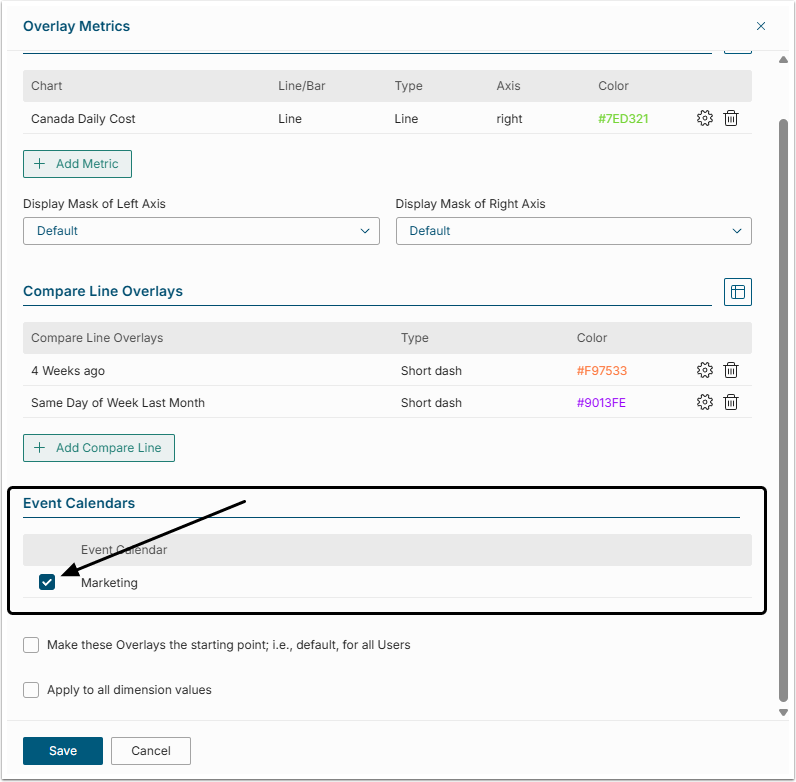
To hide events from a specific calendar from the Chart:
- Click [Manage Overlays].
- Find an Event Calendars grid and deselect the Calendars that should not be displayed on the Chart.
- [Save] the changes.
5. Other Overlay Options

Once the necessary Overlays are added to the chart, their displaying options can be configured as follows:
- Make these Overlays the starting point: If this box is checked, all Users, who open this chart are going to see added overlays.
- Apply to all dimension values: If this box is checked, added overlays are going to be displayed at the charts of all Dimension Values. If the Metric is not Dimensioned, this field is not shown at the Manage Overlays window.