Report Metrics are KPI Chart components that live natively inside a Report, displaying a numeric measure with variance calculations, status indicators (Stoplight), overlays, and a Summary Panel. They are the modern successor to standalone Metrics. This article describes how to configure a Report Metric from Report Editor.
PREREQUISITES:
- Power User must have access to create or edit a Report.
- A Report backed by a Dataset that supplies the Date Column and one or more numeric measure columns.
- For variance against a prior value, the Dataset must have history enabled and contain at least two historical instances.
1. Configure Measures
Access Content > Report Name Link > Content tab
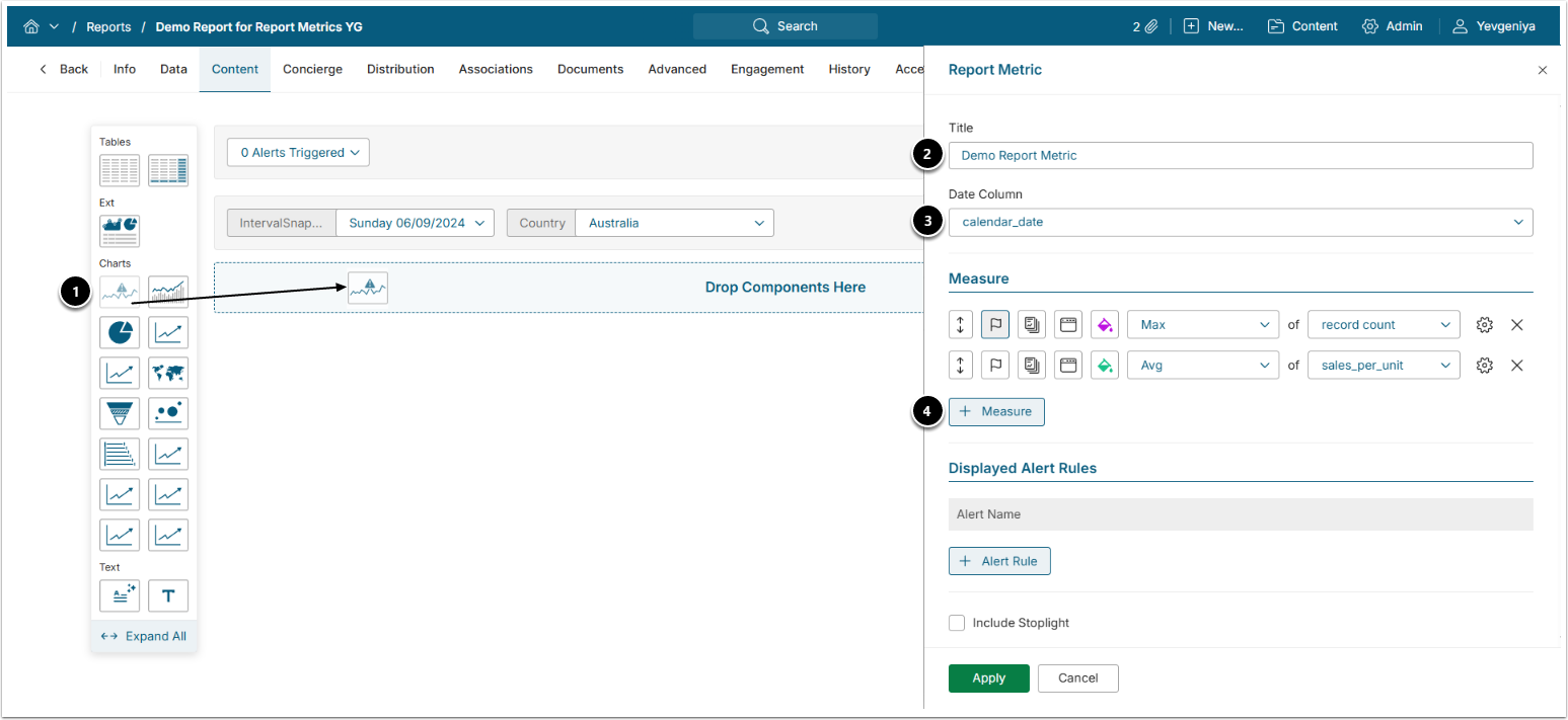
- Report Metric: Drag a component from the Components Panel onto the Report layout.
- Title: Enter a descriptive phrase.
- Date Column: Choose the Dataset column that supplies the X-axis (the Metric's date dimension).
- [+Measure]: Add a numeric column and its aggregation function if needed to plot as the Y-axis values.
For each entry in the Measure fields you can:
- flag one measure as Primary: the KPI the visualization leads with, when more than one measure exists;
- enable Default Overlay in Tile: show this measure's value directly on the homepage tile by default, instead of requiring a click into the full chart;
- enable Default Overlay in Full Chart: show this measure's value directly on the full chart in the Viewer by default, instead of only on hover;
- set its color;
- relabel it (gear icon to the right).
When two or more measures exist, an additional measure can be designated as a Target for use by the Stoplight and KPI variance calculations.
NOTE: Values printed on the chart use the display mask of the underlying measure column, so on-chart formatting matches the formatting applied to the Dataset column.
2. Add Alert Rule
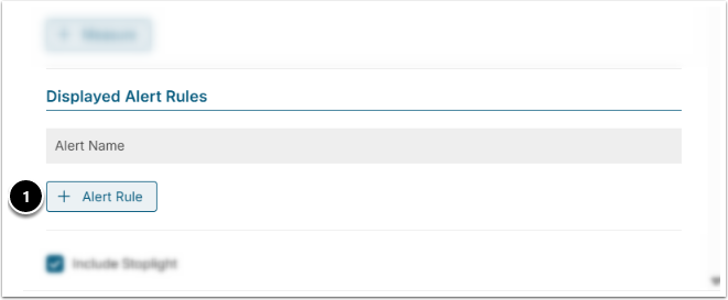
- [+Alert Rule]: Add an Alert Rule pre-configured via the Report Editor.
- For instructions on how to configure Alert Rules, refer to Adding Alert Rules to Dataset Report.
3. Configure Stoplight Status
Stoplight adds status indicators to the Metric based on how the current value compares to a threshold, a prior value, or a target.
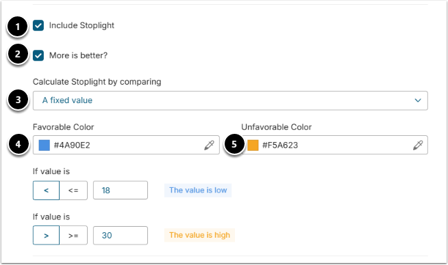
- Include Stoplight: Enable to turn on the status indicator.
- More is better?: Enable if higher values are favorable, or clear it when lower values are favorable.
- Calculate Stoplight by comparing: Choose how the status is determined – either:
- A fixed value: Define the bounds of the good range using the numeric range inputs. Each boundary has a comparison operator selector controlling whether the boundary is strict (<) or non-strict (<=), so you can express ranges such as >= lower bound and <= upper bound.
- Prior values: Two additional controls appear:
- Compare value to selects the calculation method used to derive the comparison value from historical data.
- Use value recorded [N] [unit] ago sets how far back that historical value is taken from (a number of days, weeks, months, or years). The stoplight then colors the current value against that computed prior value, using the same favorable/unfavorable direction set by More is better? above.
- A target: Use the Use this target drop-down to select which measure designated as a Target the thresholds evaluate against. Color zones are then calculated relative to that target value. The Target may be a separate column from the primary plotted measure, and where the target has no value for a given date, that gap is left uncolored rather than removing the whole Stoplight. NOTE: The Target option requires at least two measures with one set as a Target.
- Favorable Color: Choose the color for favorable values.
- Unfavorable Color: Choose the color for unfavorable values.
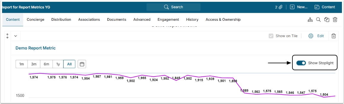
If Stoplights are configured for the Report Metric, the Show Stoplight toggle appears in both Editor and Viewer as exemplified below.
4. Configure KPI Variance
KPI variance shows how the latest value has changed against a baseline, either an earlier period or a target column. The result appears in the Summary Panel, the Report info drop-down, the chart labels, and the homepage Tile.
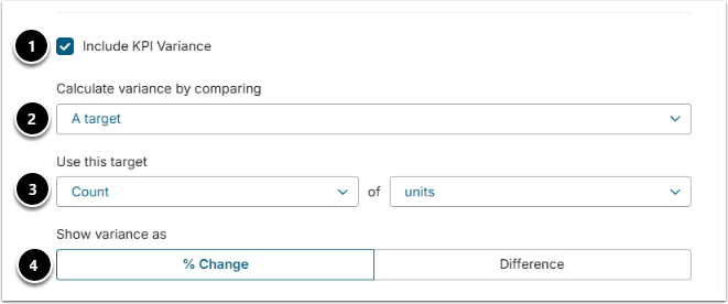
- Include KPI Variance: Enable to turn on the calculation.
- Calculate variance by comparing: Choose one of:
- A prior value: Set the compare-back period using Compare to value [N] [unit] ago — enter the number of periods to look back and choose the unit (day, week, month, or year). For example, with daily data and the period set to 7 days, the variance compares the latest point against the point 7 days earlier. The charted moving average is calculated over this configured window, not as a cumulative average of all prior points.
- A target: A Target selector appears, matching the Stoplight target control — choose a Dataset column and an aggregation function. The variance is then the difference between the latest value and the resolved Target value.
- Show variance as: Controls the display for either comparison basis:
- % Change (default) shows the change as a percentage.
- Difference shows the raw numeric change in the measure's own units, formatted with the measure's display mask. In this mode, the row and suffix labels drop percentage wording, and if the prior value is zero, the numeric change is still shown.
5. Add Overlays
Overlays plot additional series alongside the base series for visual comparison. Each overlay is another Report Metric's series — any Report Metric you have access to, not only ones built from the same Dataset.
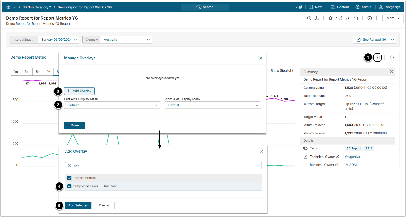
- Select the Overlay icon in the upper right of the Report Metric Viewer to open Manage Overlays.
- Change Axis Display Masks to control axis formatting if needed.
- [+Add Overlay]
- Select a Metric from the list.
- [Add Selected]
5.1. Edit Overlays
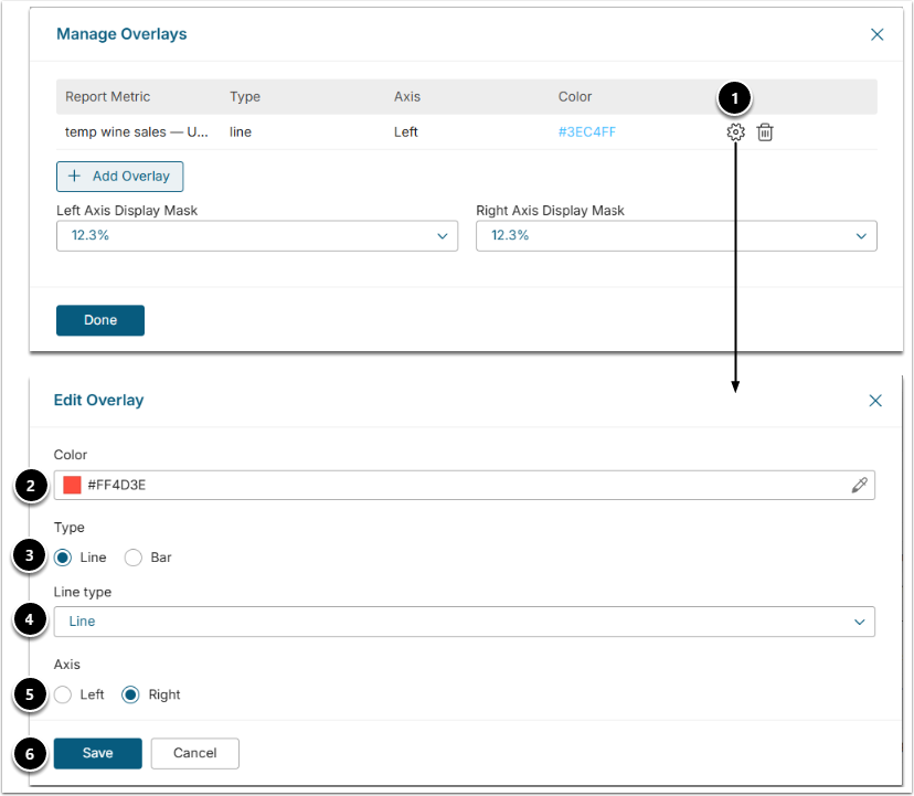
- Click the gear icon.
- Color: Single-click a new color from the palette to select it. If several charts are laid over the original one, every additional Metric is going to get its own color.
- Type: Select how the chart is displayed.
- Line Type: This field is shown only if "Line" value is selected in the field above. The line of the Overlay Metric can be dashed, dotted, etc. Select different line types for different overlay charts.
- Axis: It is recommended to place the Axis of the Overlay Chart on the right side of the original chart.
- Click [Save].
6. Set Additional Options
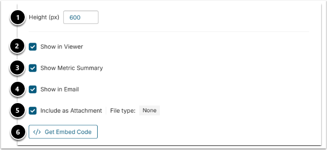
- Height (px): Set the pixel height of the chart.
- Show in Viewer: Control whether the component displays to users viewing the Report.
- Show Metric Summary: Only visible while Show in Viewer is on; make the Summary Panel available.
- Show in Email: Include the Metric when the Report is sent via email or Burst.
- Include as Attachment: Include the Metric as a file attachment (PPT/PDF/Excel) when emailed. Configured on the Distribution tab.
- Get Embed Code: Retrieve an embed code of the chart for development purposes.
7. Configure Filtering
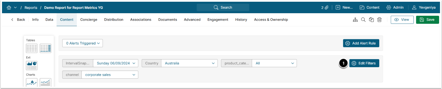
- In the Report editor, click [Edit Filters] and select a filter to open the Column Edit sidebar.
- For instructions on how to configure Filters, refer to Applying Filters in Dataset Reports.