Multi-Metrics are not supported beginning in v7.0.1.
This article describes how to select the appropriate type of element to visualize your data. An overview is provided for the typical use-case scenarios as well as the advantages and key constraints for the 3 primary types of elements supported by Metric Insights:
1. Metric Usage
A Metric is the right element type to use when you want to chart a key measure across time. A metric may include a dimension and is limited to a single measure and must show trends over-time.
Key Requirements for a Metric:
- Time must be the X-axis in the chart
- A Metric Chart can only include a single Measure
Advantages of Metrics:
- Moving Average Lines can be automatically created in the Сhart
- A comparison line can be defined to visually compare values to a prior period (e.g. 'Same time last year')
- Statistical and Stoplight views can be automatically created
- External events can be overlaid on the chart
- Targets can be associated to the metric with variances displayed in the chart
- Alerts are easily generated for metrics by regular users
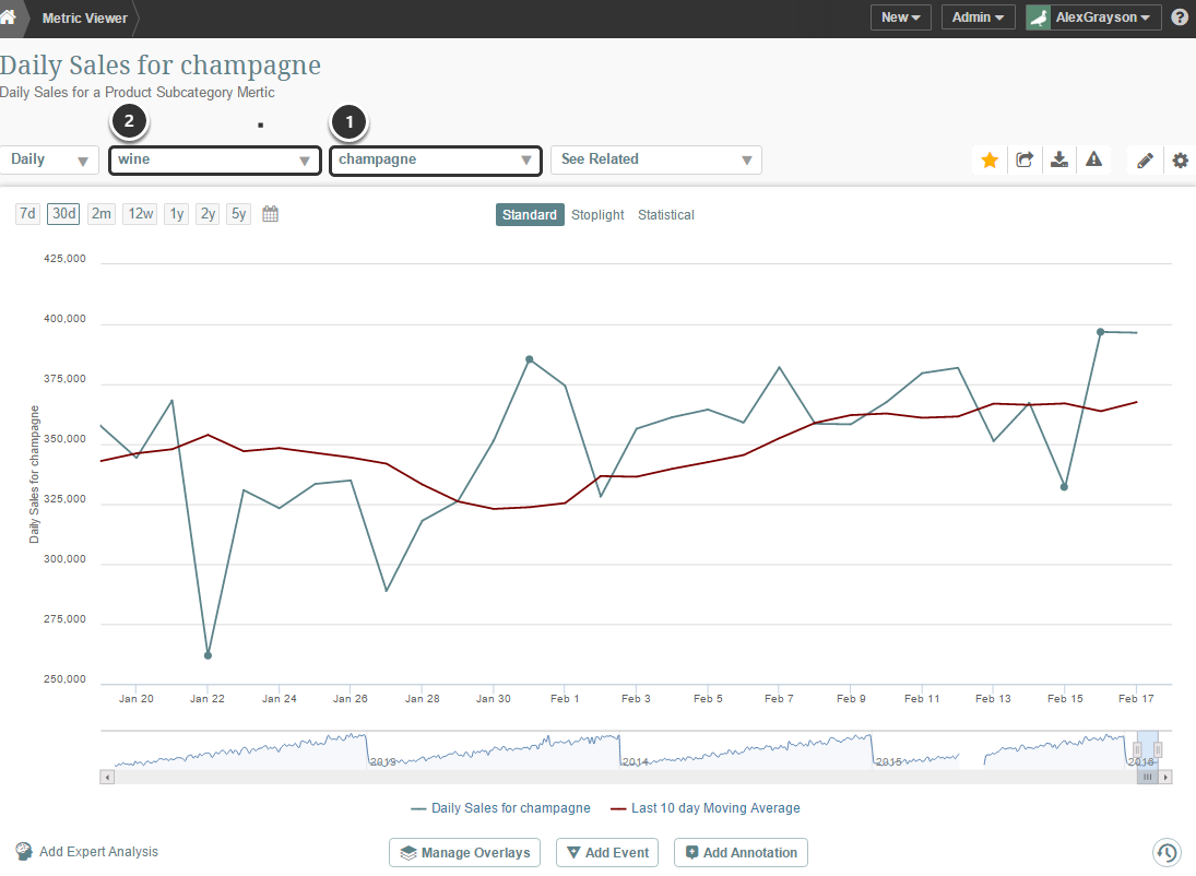
The above example illustrates a metric that charts the Sales measure using a dimension drop-down for Product Subcategory (1). A parent Category (2) value is also included as a drop-down in the chart.
2. Multi-Metric Usage
A Multi-Metric is used when you want to combine more than one Metric together in the same chart.
Key Requirements for a Multi-Metric:
- Metrics must first be defined individually before they can be included in a Multi-Metric chart
- Multi-Metrics support only Bar and Line visualizations (use a Report for other types of visualizations)
Advantages of Multi-Metrics:
- Metrics from different data sources can be easily included in the same Multi-Metric Chart
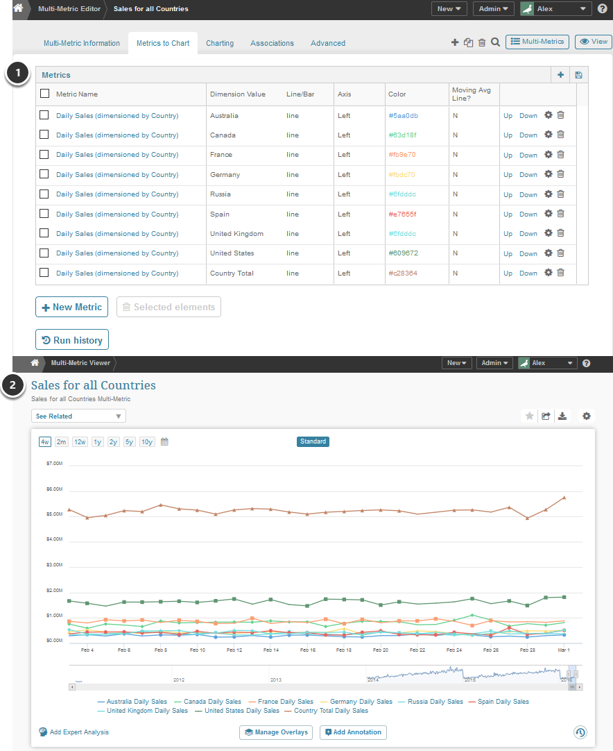
- Different dimension values for a Metric can be compared in a Multi-Metric (e.g. Sales for the US can be compared to Sales for Europe for a metric dimensioned by geography)
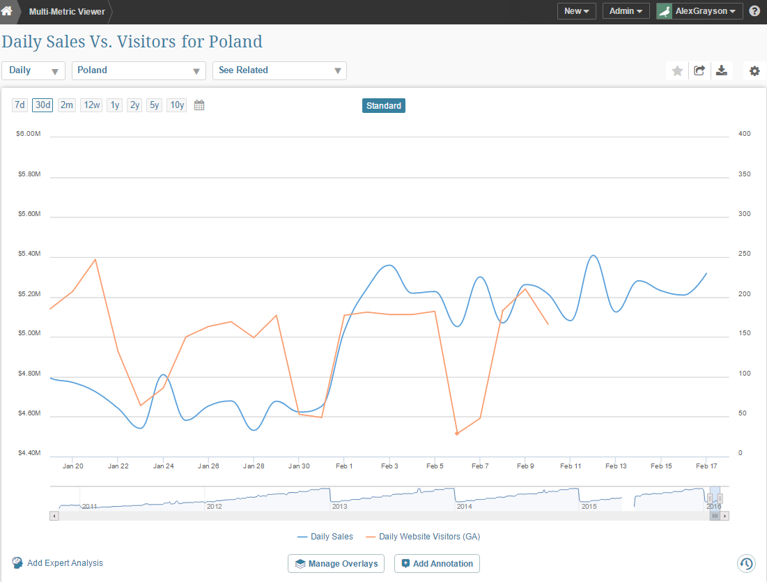
The above example illustrates a Multi-Metric that charts a Sales metric together with a Daily Visitors Metric. See below for example of second advantage.
3. Report Usage

A Report can be used to visualize any data set using a wide array of visualization options.
Advantages of Reports:
- Any arbitrary data set can be charted - no restrictions on number of measures or dimensions included in data set
- Multiple charts and pivot tables can be included in a report as long as they are all based on the same underlying data set
- If Report history is maintained, KPI and Report alerts can be easily generated by Admin or Power User
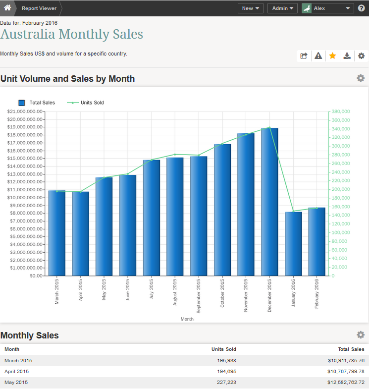
The above example shows an example where data was pivoted and charted as a stacked bar chart.


