This article describes the rules and best practices for developing custom component libraries for App Builder. It explains the required structure of a component library, the supported components and their constraints, provides examples, and outlines the rules for writing code that integrates custom components into App Builder.
TABLE OF CONTENTS:
Library Structure
Each library has the following structure:
your-library-directory
├── components/
│   └── component-internal-name/
│       ├── form.json
│       ├── metadata.json
│       └── layout.json
└── assets/(optional)components/: Root directory for all custom components in the library.
- Each subdirectory represents a single component.
component-internal-name/: Directory for a custom component.
- This name will be utilized in the component declaration as
${COMPONENT_INTERNAL_NAME}. - Used to associate configuration files with the component's runtime implementation.
form.json: Defines the component's configuration UI in the App Builder.
- Specifies:
- Field definitions and default values.
- Tabs and form layout.
- Conditional logic using
deps. - Async selectors and data sources.
- Does not define rendering or runtime behavior.
metadata.json: Defines display metadata for the component picker.
- Has no impact on runtime logic or render behavior.
- Has the following structure:
{
    "name": "Component Name",
    "icon": "briefcase"
}name: Human-readable label shown in the App Builder.icon: Internal name of the icon from the core application displayed next to the component.
layout.json: Defines component layout.
- Has the following structure:
{
    "flex-direction": "column",
    "justify-content": "flex-start",
    "align-items": "stretch",
    "justify-self": "",
    "align-self": "",
    "width": "",
    "height": "",
    "margin": "",
    "padding": "0",
    "background-color": "",
    "border-color": "",
    "border-radius": "",
    "border-width": "",
    "resizable": "off",
    "font-size": "13px",
    "font-family": "",
    "color": "",
    "size-type-width": "auto",
    "size-type-height": "auto",
    "background-image": "",
    "background-size": "",
    "background-repeat": ""
}assets/: Optional directory that may contain the built code for the components.
1. Configure Component Properties in form.json
The form.json file defines the settings panel displayed in the App Builder.
File Structure:
{
  "fields": {...},
  "settings": {
    "tabs": [
      {
        "name": "Tab Name",
        "components": [...]
      }
    ]
  }
}
The fields section defines field defaults and special field behavior:
{
  "fields": {
    "simple_field": {
      "default": "default_value"
    },
    "asset_field": {
      "variable": "image",
      "item_type": "asset"
    },
    "dataset_field": {
      "variable": "dataset_id",
      "item_type": "dataset",
      "default": ""
    }
  }
}default: Default field value.variable: Variable name for special fields.item_type:asset(files) ordataset(datasets).
1.1. Supported Form Components
FormText
Single-line text input.
{
  "name": "title",
  "label": "Title",
  "component": "FormText",
  "props": {
    "placeholder": "Enter title..."
  }
}FormTextarea
Multi-line text input.
{
  "name": "description",
  "label": "Description",
  "component": "FormTextarea",
  "props": {
    "rows": 3
  }
}FormRichText
Rich text editor.
{
  "name": "content",
  "label": "Content",
  "component": "FormRichText"
}FormSwitch
Toggle switch (Yes/No).
{
  "name": "show_icon",
  "label": "Show Icon",
  "component": "FormSwitch",
  "data": [
    { "value": "Y", "label": "Yes" },
    { "value": "N", "label": "No" }
  ]
}FormToggleButtonGroup
Grouped button selector.
{
  "name": "direction",
  "label": "Direction",
  "component": "FormToggleButtonGroup",
  "props": {
    "fullWidth": true,
    "xs": "6"
  },
  "data": [
    { "value": "horizontal", "label": "Horizontal" },
    { "value": "vertical", "label": "Vertical" }
  ]
}
Example with icons instead of labels:
{
  "name": "align",
  "label": "Align",
  "component": "FormToggleButtonGroup",
  "props": {
    "fullWidth": true,
    "icons": {
      "left": "builder-alignment-left",
      "center": "builder-alignment-center",
      "right": "builder-alignment-right"
    }
  },
  "data": [
    { "value": "left", "label": "" },
    { "value": "center", "label": "" },
    { "value": "right", "label": "" }
  ]
}FormSelect
Async dropdown backed by system data sources.
{
  "name": "folder_id",
  "label": "Folder",
  "component": "FormSelect",
  "asyncDataUrl": "/data/app/select-data?source=folder",
  "props": {
    "applyVirtualList": true
  }
}
See the list of supported data sources in the table below.
NOTE: props.settings contains metadata about the selection, not the actual data. To retrieve the actual data; e.g., Dataset rows, Folders, Elements, use the corresponding API endpoints.
| Source Parameter | Description |
|---|---|
?source=folder | Folders |
?source=category | Categories |
?source=favorite | Favorites |
?source=element | Elements (Metrics, Reports) |
?source=dataset | Datasets |
?source=dataset_column | Dataset columns (requires datasetId) |
ChooseIcon
Icon picker.
{
  "name": "icon",
  "label": "Icon",
  "component": "ChooseIcon",
  "props": {
    "iconSet": ["mi"]
  }
}UploadImage
Image upload component.
{
  "name": "image",
  "label": "Image",
  "component": "UploadImage"
}
Field definition for asset:
{
  "fields": {
    "image": {
      "variable": "image",
      "item_type": "asset"
    }
  }
}1.2. Conditional Fields
Use deps to dynamically show, hide, or modify fields.
Basic Structure
{
  "deps": [
    {
      "scope": "control",
      "rules": [
        { "field": "field_name", "cond": "=", "data": "value" }
      ],
      "effect": {
        "_r_class_d-none": true
      }
    }
  ]
}Supported Conditions
| Operator | Description |
|---|---|
= | Equals |
"" | Has any value |
Supported Effects
| Effect | Description |
|---|---|
_class_d-none | Hide field |
_r_class_d-none | Show field |
urlParams.field | Set dynamic URL parameters |
Example: Show/Hide on Toggle
{
  "name": "link",
  "label": "External Link",
  "component": "FormText",
  "props": {
    "_class_d-none": true
  },
  "deps": [
    {
      "scope": "control",
      "rules": [
        { "field": "navigate_to", "cond": "=", "data": "external" }
      ],
      "effect": {
        "_r_class_d-none": true
      }
    }
  ]
}1.3. Cascading Selects
Use dependent selects to filter options based on another field’s value; e.g., Dataset → Column.
Field definitions:
{
  "fields": {
    "dataset_id": {
      "variable": "dataset_id",
      "item_type": "dataset",
      "default": ""
    },
    "dataset_column": {
      "default": ""
    }
  }
}
Dataset selector:
{
  "name": "dataset_id",
  "label": "Dataset",
  "component": "FormSelect",
  "asyncDataUrl": "/data/app/select-data?source=dataset",
  "props": {
    "applyVirtualList": true
  }
}
Column selector:
{
  "name": "dataset_column",
  "label": "Column",
  "component": "FormSelect",
  "asyncDataUrl": "/data/app/select-data",
  "props": {
    "urlParams": {
      "datasetId": "",
      "source": "dataset_column"
    }
  },
  "deps": [
    {
      "scope": "control",
      "rules": [
        { "field": "dataset_id", "cond": "", "data": "" }
      ],
      "effect": {
        "urlParams.datasetId": "$dataset_id",
        "_r_class_d-none": true
      }
    }
  ]
}- Use
urlParamsfor dynamic API parameters. - Reference other fields using
$field_name. - Use
depsto control visibility and parameter updates.
1.4. Common Properties Reference
| Prop | Type | Description |
|---|---|---|
_class_d-none |
boolean | Hide field by default |
fullWidth |
boolean | Render field using full container width |
xs |
string | Grid column size (e.g. "6" = half width) |
placeholder |
string | Input placeholder text |
rows |
number | Number of visible rows (textarea only) |
applyVirtualList |
boolean | Enable virtual scrolling for large lists |
urlParams |
object | Dynamic URL parameters for async data requests |
iconSet |
array | Icon sets to display (e.g. ["mi"]) |
icons |
object | Map of values to icon names |
2. Write Code for React Custom Components
Once you have configured component properties, proceed to write code that will integrate those components into the App Builder as described below.
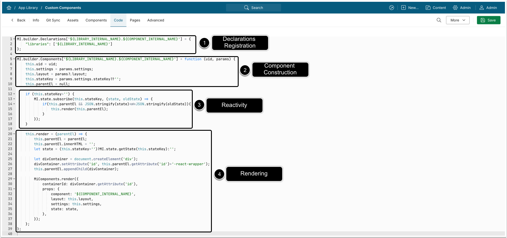
- Register the component in the global declarations registry:
MI.builder.Declarations['${LIBRARY_INTERNAL_NAME}.${COMPONENT_INTERNAL_NAME}'] = {
  "libraries": ['${LIBRARY_INTERNAL_NAME}']
};-
${LIBRARY_INTERNAL_NAME}: Your library's internal name; e.g.,core.- NOTE: The Internal name of the Library that will be created in MI must match this value.
${COMPONENT_INTERNAL_NAME}: Your component's internal name; e.g.,navigation-tile.- NOTE:
${COMPONENT_INTERNAL_NAME}must match the name of the directory where the component is located.
- NOTE:
- The full key:
core.navigation-tile.
- Define component's behavior with the constructor:
MI.builder.Components['${LIBRARY_INTERNAL_NAME}.${COMPONENT_INTERNAL_NAME}'] = function (uid, params) {
  this.uid = uid;
  this.settings = params.settings;
  this.layout = params?.layout;
  this.stateKey = params.settings.stateKey??'';
  this.parentEl = null;
  // ...
};uid: Unique identifier for this component instance.params.settings: Configuration object containing values fromform.json.- See Configure Component Properties in form.json for details.
params?.layout: Object containing component layout settings fromlayout.json.- See Library Structure for details.
- Optionally, enable reactivity by subscribing to state changes:
if (this.stateKey > '') {
  MI.state.subscribe(this.stateKey, (state, oldState) => {
    if (
      this.parentEl &&
      JSON.stringify(state) !== JSON.stringify(oldState)
    ) {
      this.render(this.parentEl);
    }
  });
}
How it works:
- Subscribes only if
stateKeyis provided. - Re-renders the component when state value changes.
- Avoids unnecessary renders when state is unchanged.
- Render method:
this.render = (parentEl) => {
  this.parentEl = parentEl; // Store element reference
  this.parentEl.innerHTML = ''; // Clear existing content
  let state =
    this.stateKey > '' ? MI.state.getState(this.stateKey) : ''; // Retrieve state
  // Create wrapper div for React
  let divContainer = document.createElement('div');
  divContainer.setAttribute(
    'id',
    this.parentEl.getAttribute('id') + '-react-wrapper' // Create wrapper <div>
  );
  this.parentEl.appendChild(divContainer);
  // 5. Render React component
  MiComponents.render({
    containerId: divContainer.getAttribute('id'),
    props: {
      component: '${COMPONENT_INTERNAL_NAME}', // Mount React component
      layout: this.layout;
      settings: this.settings,
      state: state,
    },
  });
};- Render flow:
- Store the parent element reference.
- Clear existing DOM content for this component instance.
- Retrieve state (if applicable).
- Create and append a wrapper
<div>used as the React mount point. - Calls
MiComponents.render()to mount the React component withlayout,settings, andstate.
3. Upload Library to Metric Insights
Once you have built a library with custom components, add it to App Builder by either uploading the asset directly as a ZIP file, or via a Git sync. You must also enter the code from the previous step into App Builder's Code tab to enable the library.
NOTE: See Add Library with Custom Components to App Builder for details.