NOTE: This feature is currently in Alpha Preview and is not intended for production use-cases. We will continue to iterate with increasingly stable alpha releases. A Beta version will be available in v7.3.0, with full general availability planned for v7.3.1.
Introduced in v7.1.0, the App Builder is a drag-and-drop design tool for creating custom Apps directly from the browser without writing any code. Using App Builder does not require any HTML/CSS knowledge: just create a new App, enable the App Builder toggle and start building your App, the applied changes are immediately displayed on the App canvas. This tool is intended to be used primarily by the design teams and BI professionals, analysts and report developers. The created Apps can then be expanded by the App developers by adding custom components.
The App Builder includes a set of components that can be selected from the component library, including menus, embedded elements, and list components. Currently the components are limited, but will be dramatically expanded in the future. The styling and visibility options of the available components can be customized, supporting file uploads and asset management. You can create your own style variables allowing for re-usability across the whole App, eliminating the need to repeatedly set styles for each component, currently Color Style Variables are supported.
This article provides a high-level overview of the main App Builder functionality.
Prerequisites:
Set the ENABLE_APP_BUILDER System Variable to 'Y' to enable App Builder for new Portal Pages.
- See Setting System Variables for details.
Table of contents:
1. Create New App
Access Content > Apps
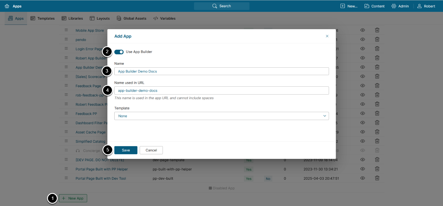
- [+ New App]
- Enable the Use App Builder toggle
- Name: Enter an App name
- Name used in URL: Enter a name to be used in the App URL
- NOTE: Letters, numbers, dashes, and underscores are the only supported characters for App URL names
- [Save]
NOTE: Alternatively, create an App Template enabling the Use App Builder toggle, then populate a new App selecting the Template.
2. Open App Builder
Access Builder tab
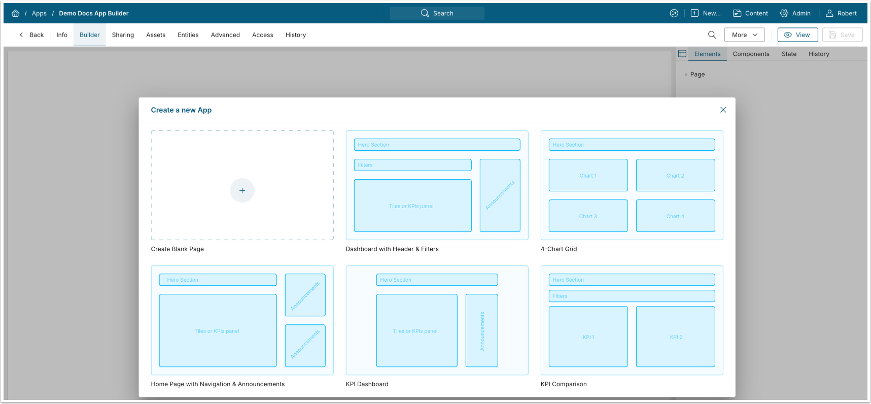
Select a Layout for your App, or continue with a blank page.
NOTES:
- App Builder supports adding libraries with custom components.
- See Add Library with Custom Components to App Builder for details.
- For information on creating libraries with your own custom components, see Create Library with Custom Components for App Builder.
- See App Builder Built-In Components for information on the built-in App Builder Components.
- See Custom Components for App Builder for details on the independently managed Custom Components for App Builder.
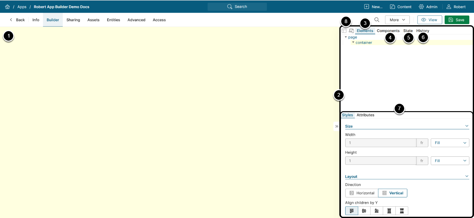
- App Builder Canvas: Drag-and-drop the components from the App Builder menu here to add them to your App.
- App Builder Menu: The main menu of the App Builder containing the menu items described below.
- Elements: The DOM-like structure of the App containing all of its elements. Whenever a new component is added to the App, it's displayed on the Elements tab.
- Drag the elements to move them within the App structure.
- Components: The library with the available components. Drag-and-drop the component from here to add it to the App.
- State: Displays state for the menu container and all filter elements, if such are present.
- History: Displays the saved changes from the previous sessions and the unsaved changes from this session.
- NOTE: The unsaved changes from the current session will disappear if you exit the App without saving.
- Styles menu: The menu to configure the styles, attributes, and the element-specific settings.
- Select a component on the Elements tab to open this menu.
- Action icons: Toggle icons to control the App Builder canvas display.
- Layout: Displays the grid highlighting each element's size.
- Select Device: Enables the Select Device menu allowing to emulate the App display for a selected device.
3. Configure Elements

- Click on any element to open the element configuration menu
- Settings: Provide additional settings depending on the element type.
- All element types, except for containers, have component-specific settings. For instance, Embedded Elements require selecting an element and view options.
- Styles: Configure the selected element's style:
- Size: Set the element's width and height
- Layout: This is a wrapper for flex display that controls the layout of the selected element and its children by the X and Y axes.
- Spacing: Configure the element's margin and padding. Margin is the space between the element's border and other elements, and padding is the space between the element's body and its border.
- NOTE: The spacing can be configured for all sides or for individual sides.
- Border: Set the element's border styles.
- Background: Configure the element's background styling.
- Text: Set the text styling for the element.
- Attributes: Edit the element's Title to change how it is displayed on the Elements tab, and set the conditions configuring the element's Visibility.
NOTES:
- See Configure Styles for App Builder Elements And Components for information on styles configuration.
- The page element has an additional Style Variables tab for defining re-usable style variables, that can be used across the whole App.
Right-click the component to open the action menu allowing to add a child container, wrap in a parent container, cut, copy, or delete it. Right-clicking the page element allows to add a menu container.