This article covers all Metric Insights shared components available via MiNamespace.render(). Embed Metric Insights functionality directly into custom Apps using ready-made UI components instead of building them from scratch. The full list of available components can also be browsed at https://<MI hostname>/dev/shared.
PREREQUISITES:
- Before using any component, ensure the MI scripts are present on the page. If the standard MI header is not included (e.g. in a custom App with
miHudLess: true), add these tags manually:
<script src="/auth/info.js"></script>
<script defer="defer" src="/js/main.js"></script>
<link href="/css/main.css" rel="stylesheet">- When using Portal Page Developer Helper locally, set
miHudLess: falseinpp-dev.config.tsto have the dev server inject these automatically.
NOTE: Render any component by calling:
MiNamespace.render({
  "component": "<component_name>",
  "props": { ... }
});
TABLE OF CONTENTS:
Element Viewer
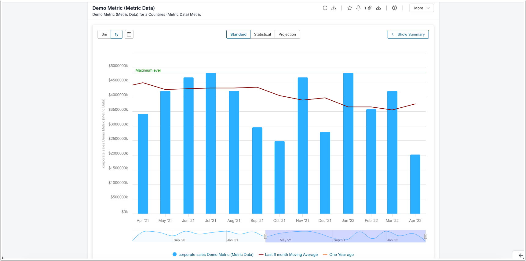
Use the Element Viewer to embed a chart, table, or report inline within a container <div> on the page. The component gives you granular control over all UI chrome and supports custom event interception.
Basic Usage
<div id="viewer-container"></div>MiNamespace.render({
"component": "element_viewer",
"props": {
"element_id": 123,
"segment_id": 0,
"height": 600,
"width": 800,
"container_id": "viewer-container"
}
});| Prop | Type | Required | Description |
|---|---|---|---|
element_id | number | Yes | The ID of the element to display |
segment_id | number | No | Segment value ID (default: 0) |
height | number | No | Height of the viewer in pixels |
width | number | No | Width of the viewer in pixels |
container_id | string | No | ID of the HTML element to render into |
Visibility Options
All visibility props default to true (visible). Set any prop to false to hide the corresponding element from view.
| Prop | Type | Description |
|---|---|---|
visibility.header | boolean | Top controls header area |
visibility.title | boolean | Element title |
visibility.description | boolean | Element description |
visibility.certification | boolean | Certification icon |
visibility.wall | boolean | Wall / paywall overlay |
visibility.extLink | boolean | External link |
visibility.actionsBar | boolean | Bottom actions bar |
visibility.iNotification | boolean | Notification icon |
visibility.iOpenExt | boolean | Open in external window icon |
visibility.bookmark | boolean | Bookmark button |
visibility.segment | boolean | Segment selector dropdown |
visibility.eFilters | boolean | Element filters |
visibility.summary | boolean | Summary section |
visibility.action_select | boolean | Action select menu |
visibility.control_buttons.info | boolean | Info button |
visibility.control_buttons.lineage | boolean | Lineage button |
visibility.control_buttons.favorite | boolean | Favorite button |
visibility.control_buttons.download | boolean | Download button |
visibility.control_buttons.open_external_report | boolean | Open external report button |
visibility.control_buttons.full_screen | boolean | Full screen button |
visibility.control_buttons.edit | boolean | Edit button |
visibility.control_buttons.expert_analysis | boolean | Expert analysis button |
visibility.control_buttons.rating | boolean | Rating button |
visibility.action_select_buttons.share | boolean | Share button in action menu |
visibility.action_select_buttons.rating | boolean | Rating button in action menu |
visibility.action_select_buttons.lineage | boolean | Lineage button in action menu |
visibility.action_select_buttons.expert_analysis | boolean | Expert analysis button in action menu |
visibility.action_select_buttons.notification | boolean | Notification button in action menu |
Custom Events
Use custom_events props to intercept default behaviors and receive them as DOM events instead. Set the relevant prop to true to enable interception, then attach a listener to handle the event in your own code:
MiNamespace.render({
  "component": "element_viewer",
  "props": {
    "element_id": 123,
    "container_id": "viewer-container",
    "custom_events": {
      "external_link_click": true,
      "favorite_click": true
    }
  }
});

document.addEventListener("mi-element-viewer", (event) => {
  if (event.detail.action === "external-link-click") {
    console.log("URL:", event.detail.payload.url);
    window.open(event.detail.payload.url, "_blank");
  }
  if (event.detail.action === "favorite-click") {
    console.log("Element ID:", event.detail.payload.elementId);
    console.log("Segment Value ID:", event.detail.payload.segmentValueId);
  }
});| Custom Event Prop | Description |
|---|---|
custom_events.external_link_click | Intercept external link clicks |
custom_events.favorite_click | Intercept favorite button clicks |
Event Payloads
external-link-click
{
  action: "external-link-click",
  payload: {
    url: string,        // The external link URL
    elementInfo: object // Full element metadata object
  }
}
favorite-click
{
  action: "favorite-click",
  payload: {
    elementId: number,       // Element ID
    segmentValueId: number   // Dimension Value ID
  }
}Popup

Use the Popup component when you need to surface a brief informational message to the user without navigating away from the current page. The component renders a simple modal dialog with a title and a text message.
MiNamespace.render({
  "component": "popup",
  "props": {
    "title": "Info",
    "text": "Message"
  }
});NOTE: Both [OK] and [Cancel] buttons close the popup.
| Prop | Type | Required | Description |
|---|---|---|---|
title | string | Yes | Title shown at the top of the popup |
text | string | Yes | Body message displayed in the popup |
Access Denied Popup
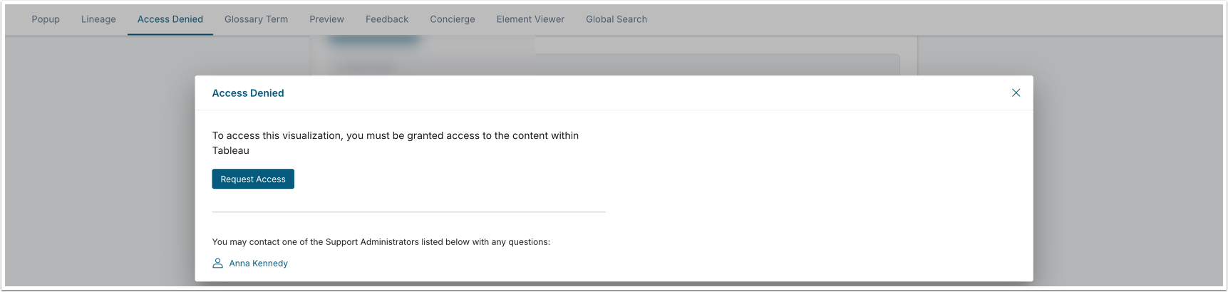
Use this component when you need to inform a user that they do not have access to a specific element and Dimension combination. It renders an access denied message in a popup, making it easy to surface permission boundaries without redirecting the user away from the current page.
MiNamespace.render({
  "component": "access_denied_popup",
  "props": {
    "element_id": 53,
    "segment_value_id": 0
  }
});| Prop | Type | Required | Description |
|---|---|---|---|
element_id | number | Yes | The ID of the element the user was denied access to |
segment_value_id | number | Yes | The segment value ID (0 for the default segment) |
| boolean | No | Whether to display the [View Related] button. |
| string | No | The text of the [View Related] button. |
| object | No | Event enabled when clicking on the [View Related] button.
|
| Custom events | |||
| boolean | No | Enable custom events on click. |
Glossary Term Popup
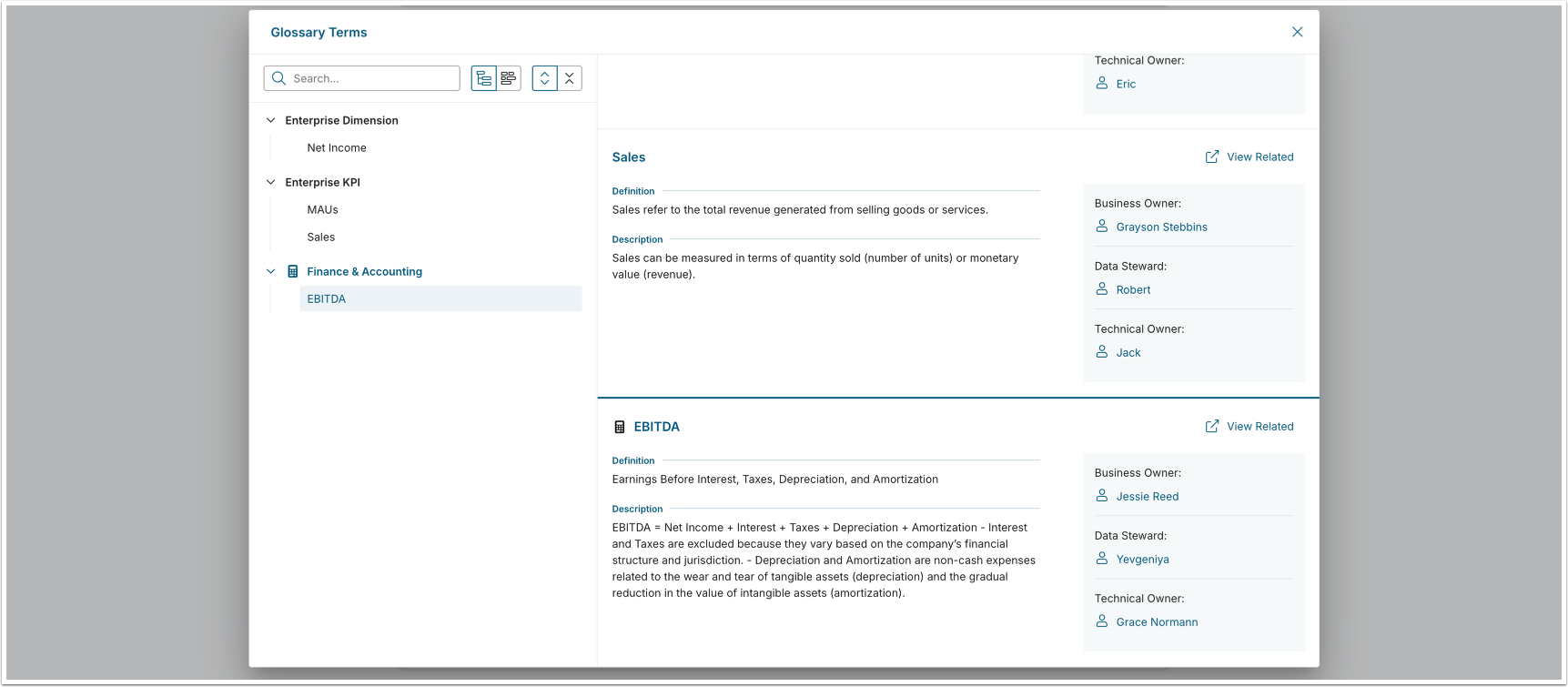
Use this component when you want to surface glossary term definitions inline, without navigating the user away from the current context. The popup can display a single term or multiple terms at once, making it useful for annotating dashboards or reports with business definitions.
MiNamespace.render({
  "component": "glossary_term_popup",
  "props": {
    "topicId": 53,
    "topicIds": [53, 18, 23, 212],
    "showViewRelatedButton": true,
    "viewRelatedButtonLabel": 'Show Related Items',
    "customEvents": {
    viewRelatedClick: true
    }
  }
});| Prop | Type | Required | Description |
|---|---|---|---|
topicId | number | Yes | The primary Glossary Term ID to display |
topicIds | number[] | Yes | Array of all Glossary Term IDs to include in the popup |
Glossary Term Popup: Subscription to Custom Events
Subscription to custom events:
document.addEventListener('mi-glossary-term-popup', (event) => {
  console.log('custom event', event);
});
Example of the event payload:
{
  "action": "view-related-click",
  "payload": {
    "topicId": 114,
    "relatedElements": {
        "elements": {
            "metric": 36
        },
        "plugin": {
            "19": 1
        },
        "external_content": {
            "53": 1,
            "117": 36,
            "119": 2
        },
        "entities": {
            "dataset": 2,
            "dashboard_element": 38
        },
        "plugin_name": {
            "19": "Tableau"
        }
    }
  }
}Preview Popup
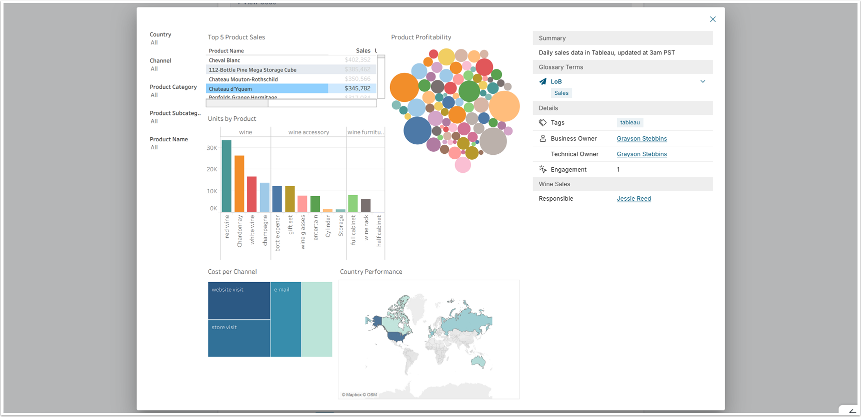
Use this component when you want to embed an Element preview popup in a custom interface. You can control which UI elements are visible and intercept title or image click events to wire in your own navigation or interaction logic. This gives you fine-grained control over how the preview behaves within your application.
MiNamespace.render({
  "component": "preview",
  "props": {
    "element": 20,
    "segment": 0,
    "custom_events": {
      "preview": {
        "title_click": true,
        "image_click": true
      }
    },
    "visibility": {
      "preview": {
        "header": false,
        "title": false,
        "control_buttons": {
          "lineage": false,
          "favorite": false,
          "share": false,
          "download": false,
          "notification": false,
          "edit": false,
          "bookmark": false
        }
      }
    }
  }
});| Prop | Type | Required | Description |
|---|---|---|---|
element | number | Yes | The element ID to preview |
segment | number | No | Segment value ID (default: 0) |
custom_events.preview.title_click | boolean | No | When true, intercepts title clicks and fires a custom event instead of navigating |
custom_events.preview.image_click | boolean | No | When true, intercepts image clicks and fires a custom event instead of navigating |
visibility.preview.header | boolean | No | Show/hide the popup header area |
visibility.preview.title | boolean | No | Show/hide the element title |
visibility.preview.control_buttons.lineage | boolean | No | Show/hide the Lineage button |
visibility.preview.control_buttons.favorite | boolean | No | Show/hide the Favorite button |
visibility.preview.control_buttons.share | boolean | No | Show/hide the Share button |
visibility.preview.control_buttons.download | boolean | No | Show/hide the Download button |
visibility.preview.control_buttons.notification | boolean | No | Show/hide the Notification button |
visibility.preview.control_buttons.edit | boolean | No | Show/hide the Edit button |
visibility.preview.control_buttons.bookmark | boolean | No | Show/hide the Bookmark button |
Feedback Prompt
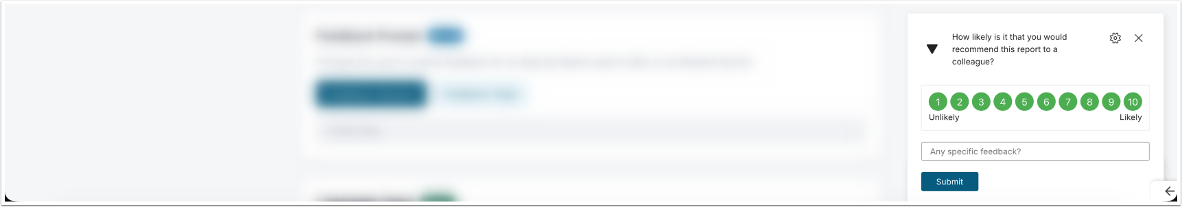
Use this component to open a feedback prompt that lets users submit feedback for either an App (identified by Name used in URL) or an Element (identified by ID). This is useful when you want to collect user input at a specific point in the user's journey.
// For an Element:
MiNamespace.render({
  "component": "feedback_prompt",
  "props": {
    "itemType": "element",
    "itemId": 42
  }
});

// For an App:
MiNamespace.render({
  "component": "feedback_prompt",
  "props": {
    "itemType": "page",
    "itemId": "how-to"
  }
});| Prop | Type | Required | Description |
|---|---|---|---|
itemType | "element" | "page" | Yes | Whether the feedback target is an element or an App |
itemId | number | string | Yes | Element ID (number) when itemType is "element", or App’s Name used in URL (string) when itemType is "page" |
Concierge Panel
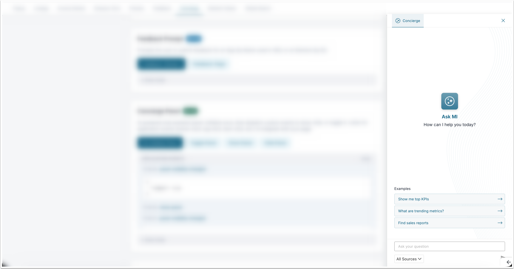
Use this component to embed an AI-powered chat assistant panel directly in your App. Initialize the panel once using MiNamespace.render(), then control its visibility and behavior by dispatching CustomEvents, giving you full programmatic control over when and how the assistant appears.
MiNamespace.render({
  "component": "concierge",
  "props": {
    "title": "Ask MI",
    "description": "How can I help you today?",
    "suggested_prompts": [
      "Show me top KPIs",
      "What are trending metrics?"
    ],
    "show_source_selector": true,
    "display_model_name": true,
    "show_search_request": true,
    "include_help_docs": true,
    "include_glossary_terms": true,
    "include_custom_faq": true,
    "load_more": true
  }
});Initialization
| Prop | Type | Required | Description |
|---|---|---|---|
welcome_icon | string | No | URL of a custom welcome/avatar icon |
welcome_icon_width | number | No | Width of the welcome icon in pixels |
welcome_icon_height | number | No | Height of the welcome icon in pixels |
bot_icon | string | No | URL of a custom bot icon shown next to responses |
title | string | No | Panel title text |
description | string | No | Subtitle / welcome message text |
start_new_chat_after | number | No | Inactivity timeout in seconds before starting a new chat session automatically |
show_source_selector | boolean | No | Show the content source selector |
display_model_name | boolean | No | Display the AI model name in the panel |
suggested_prompts | string[] | No | List of suggested prompt chips shown on the welcome screen |
show_search_request | boolean | No | Show the underlying search request that was made |
include_help_docs | boolean | No | Include MI help documentation in the search scope |
include_glossary_terms | boolean | No | Include glossary terms in the search scope |
include_custom_faq | boolean | No | Include custom FAQ content in the search scope |
available_domains | string[] | No | List of content domains that can be selected |
selected_domains | string[] | No | Domains pre-selected when the panel opens |
load_more | boolean | No | Enable "load more" pagination on results |
custom_styles.panel | object | No | Inline style overrides for the panel container |
custom_styles.welcomePage | object | No | Inline style overrides for the welcome page |
custom_styles.header | object | No | Inline style overrides for the panel header |
custom_styles.footer | object | No | Inline style overrides for the panel footer |
custom_styles.activeChat | object | No | Inline style overrides for the chat area |
custom_styles.activeChatMessage | object | No | Inline style overrides for individual chat messages |
custom_styles.activeChatMessageResultItem | object | No | Inline style overrides for result items within messages |
Controlling the Panel
After initialization, you can show, hide, or toggle the panel at any time by dispatching CustomEvents to document:
document.dispatchEvent(
  new CustomEvent('mi-concierge-panel', {
    bubbles: false,
    detail: { action: 'toggle-panel' }  // or 'show-panel' / 'hide-panel'
  })
);| Action | Description |
|---|---|
toggle-panel | Opens the panel if closed, closes it if open |
show-panel | Opens the panel |
hide-panel | Closes the panel |
Application Events
The panel fires events on document that you can listen for on your page:
document.addEventListener('mi-concierge-panel', (event) => {
  console.log(event.detail.action, event.detail);
});| Action | Description |
|---|---|
owner-click | User clicked on a content owner |
certified-username-click | User clicked on a certified user's name |
tag-click | User clicked on a tag |
term-click | User clicked on a glossary term |
item-click | User clicked on a result item |
show-in-search | User clicked "show in search" on a result |
Global Search
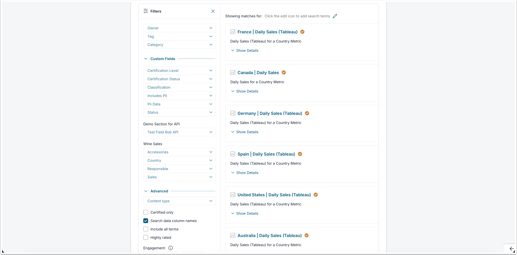
Use the Search component when you want to embed a full-featured search interface directly inside a container element on your page. As users type queries and apply filters, the component continuously syncs the current search state to a hidden <input> field as a JSON string, making it straightforward to read the current state or pre-populate the interface programmatically before rendering.
Basic Usage
<div id="search_component"></div>
<input type="hidden" id="search_params" value="" />
MiNamespace.render({
"component": "search",
"props": {
"elementId": "search_component",
"searchParamsId": "search_params",
"showFilters": true
}
});| Prop | Type | Required | Description |
|---|---|---|---|
elementId | string | Yes | ID of the <div> element the search component will render into |
searchParamsId | string | Yes | ID of a hidden <input> field where the search state JSON will be stored |
showFilters | boolean | Yes | Whether to display the built-in filter panel alongside the search results |
Reading the Search State
The component continuously writes the current search state to the hidden field as a JSON string. You can read that state at any time using the following pattern:
const hidden = document.getElementById("search_params");
const state = JSON.parse(hidden.getAttribute("value") || "{}");

console.log(state.query);   // The current search query string
console.log(state.filters); // The current filter selectionsPre-Populating the Search State
To start the component with a pre-set query or filters, write a JSON string to the hidden field before rendering. The example below shows how you can pre-populate a search for "sales" filtered to certified elements, sorted by engagement:
const hidden = document.getElementById("search_params");
hidden.setAttribute("value", JSON.stringify({
  query: "sales",
  filters: {
    type: "element",
    is_certified: "1",
    sort: "engagement"
  }
}));Filter Reference
| Filter | Type | Description |
|---|---|---|
page | number | Current results page number |
owner_id | string | Filter by content owner ID |
topic_id | number[] | Filter by topic / category IDs |
category_id | string | Filter by category ID |
is_certified | string | Filter to certified content only ("1") |
certification_level_id | string | Filter by specific certification level |
activeTab | string | null | Active tab in the search UI |
ignore_columns | string | Columns to exclude from results |
all_terms | string | Match all search terms (AND logic) |
discoverable | string | Filter by discoverable content only |
type | string | Content type filter (e.g. "element", "page") |
highly_rated | string | Filter to highly-rated content only |
created_in_last | string | Filter by recency (e.g. "7d", "30d") |
suggest | string | Enable search suggestions |
pattern | string | Name pattern filter |
engagement | string | Minimum engagement threshold |
engagement_lte | string | Maximum engagement threshold |
custom_fields | object | Custom field filters keyed by field ID |
full_filters | number | Enable full filter mode |
sort | string | Sort order (e.g. "engagement", "recent", "name") |
content_type | string | Specific content type |
plugin_id | number | Filter by plugin ID |
filter_by_source_table_name | string | Filter by source table name |
filter_by_source_table_column_name | string | Filter by source table column name |
Lineage
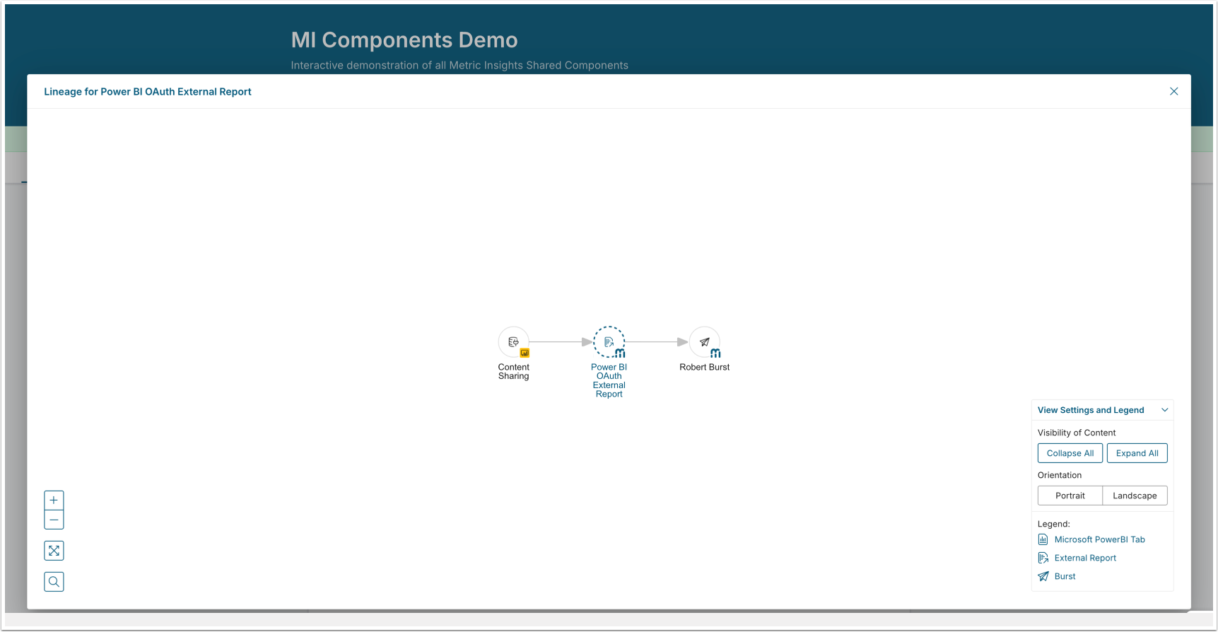
Use the Lineage component to help users understand where data comes from. The component opens a popup showing the data lineage graph for an Element or external report, making it easy to trace data origins without leaving the page.
MiNamespace.render({
  "component": "lineage",
  "props": {
    "id": 40,
    "type": "external report"
  }
});| Prop | Type | Required | Description |
|---|---|---|---|
id | number | Yes | The ID of the element or external report |
type | string | Yes | The item type, e.g. "external report" |