This article provides a reference for the built-in components available in the App Builder. Once you have created an App, these components can be added directly from the Components menu to build and customize your App's layout and functionality.
Each component described below includes a summary of its purpose and a table of configurable settings to help you understand how to use it effectively.
PREREQUISITES:
Create an App with the App Builder toggle enabled.
TABLE OF CONTENTS:
Announcements
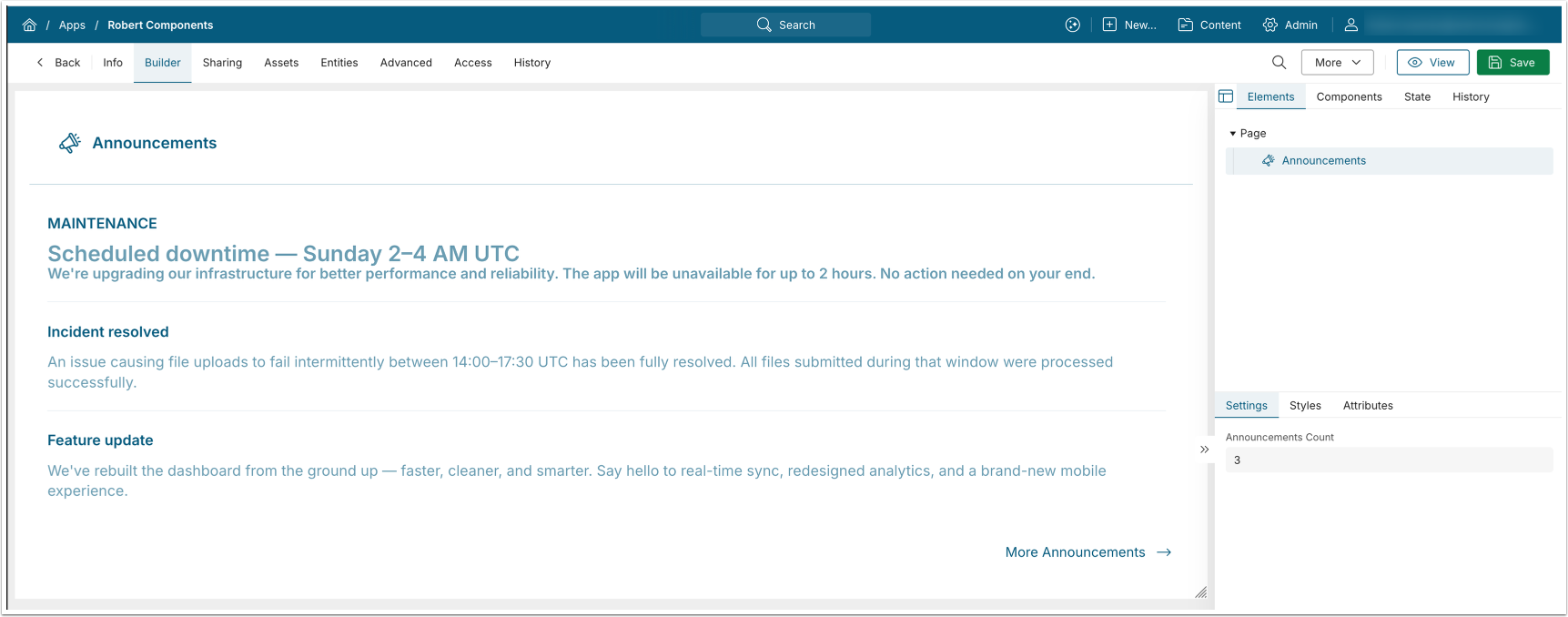
The Announcements component displays Announcements in the order of their creation, matching the order returned via the API.
Settings
| Field | Description |
|---|---|
| Announcements Count | The number of Announcements to display. |
Embed
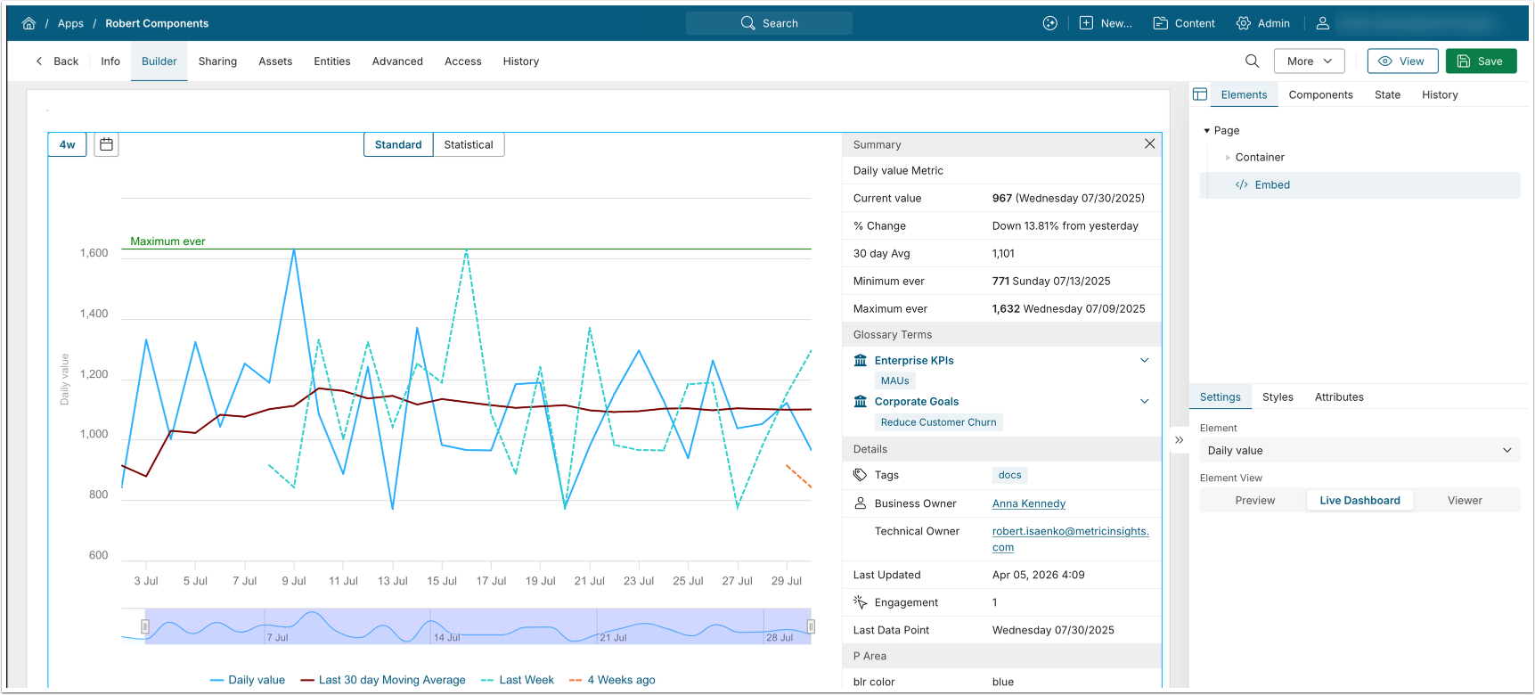
The Embed component displays the embedded view of the selected Element.
Settings
| Field | Description |
|---|---|
| Element | Select the Element to embed. |
| Element View | Select the Element View:
|
Filter
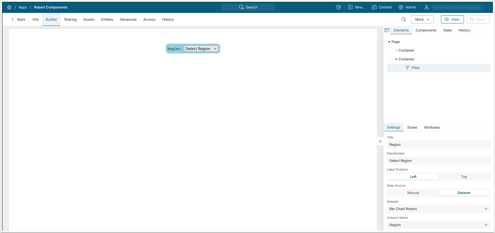
The Filter component renders a drop-down list populated with the selected values: a Dataset column or manually entered data.
Settings
| Field | Description |
|---|---|
| Title | Enter the filter label text. |
| Placeholder | Enter the filter dropdown text. |
| Label Position | Select whether the label text is displayed on the Left or on Top from the dropdown. |
| Data Source | Select whether the filter dropdown values are sourced from:
|
KPI Panel
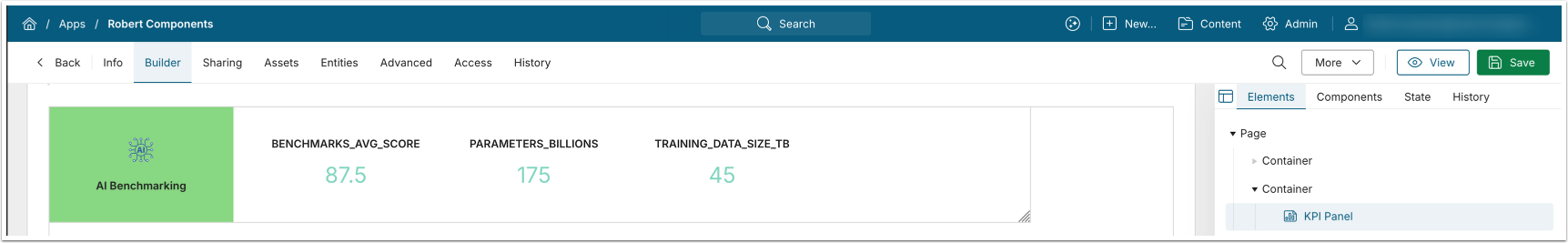
The KPI Panel displays selected Dataset column values and supports optional icon display.
Settings
| Field | Description |
|---|---|
| Title | Enter the KPI panel title text. |
| Title Icon URL | Enter the URL to the KPI panel icon. |
| Color | Select background color for the KPI panel icon. |
| Dataset | Select source Dataset for KPI panel. |
| KPI <number> column | Select the Dataset column for each KPI. |
Embed Tiles
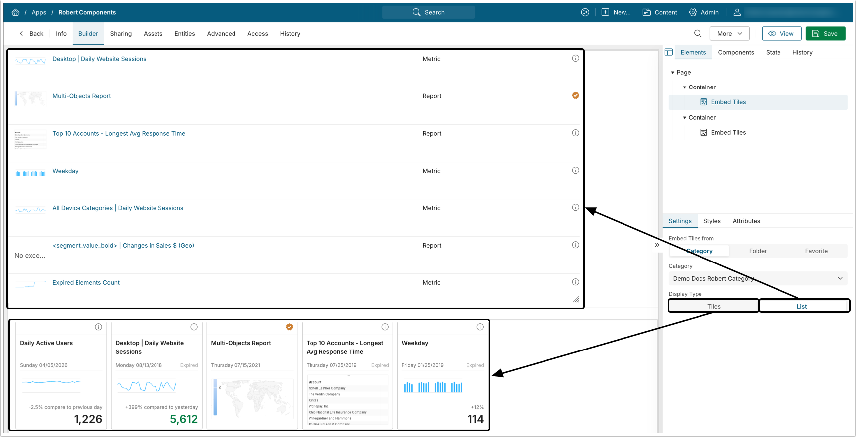
The Embed Tiles component displays tiles from the selected Category, Folder, or Favorite.
Settings
| Field | Description |
|---|---|
| Embed Tiles From | Select the source of embedded tiles:
|
| Display Type | Select whether the embedded elements are displayed as Tiles or as a List. |
Folder Menu
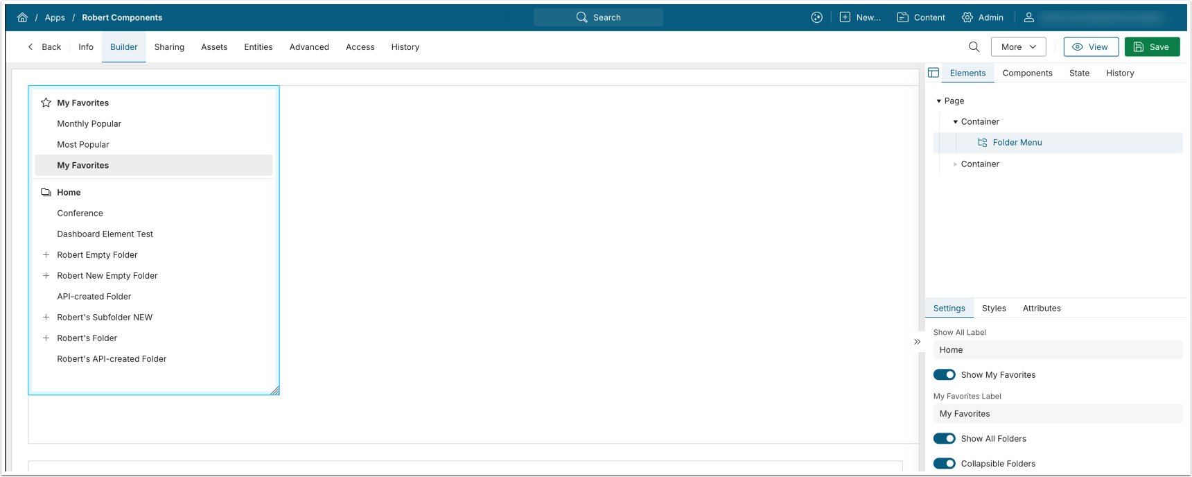
The Folder Menu component displays the folder hierarchy and supports optional display of My Favorites.
Concierge
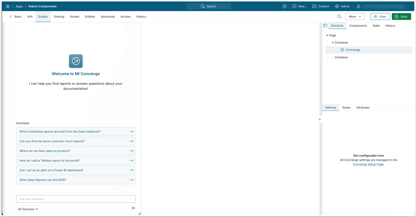
The Concierge component displays the Concierge panel, which you configure separately.
- See Installing and Configuring Concierge (v7.1.2+) for details.