As a component in Dataset Reports, KPI Visualization is a convenient way to obtain more insights about your data in a straightforward and illustrative manner. This feature has been designed to:
- Provide an ability to view more than one Metric charted line at once to explore trends and dynamics
- Apply Standard Deviation and Average graphs to illustrate unusual highs/lows
PREREQUISITES:
- Existing Report created from a Dataset that includes dates. This is required to be able to build an X-axis. These can be either Snapshot Dates or any column with date values.
1. Add KPI Visualization
Access Content > Elements > Reports > Report Name Link > Content Tab
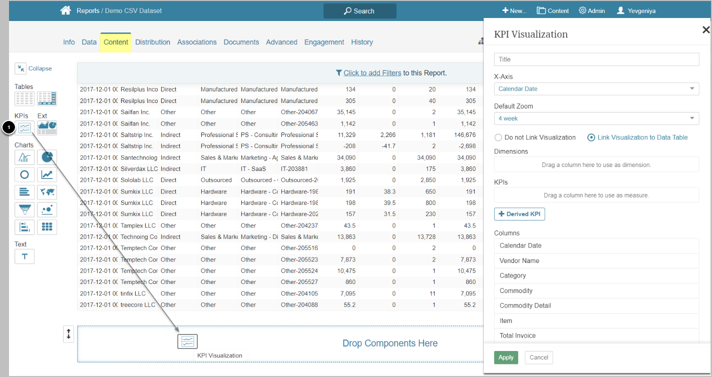
- Drag and drop the KPIs component to the frame to enable the KPI Visualization popup on the right
2. Define the Basics
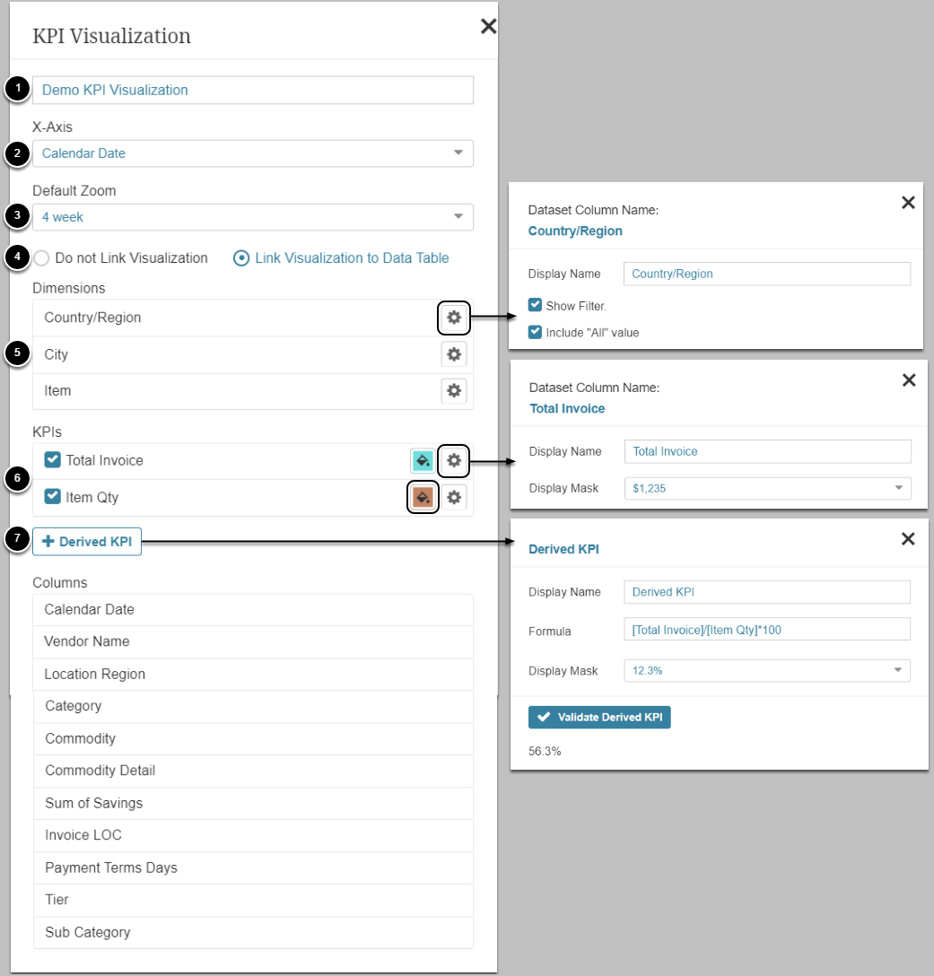
- Input a descriptive name for the Visualization
- Choose the required date column from the drop-down to build the X-Axis
- Reports built from snapshot Datasets will also include Snapshot Date as an option.
- NOTE:Snapshot Date will not be available as an option for Reports that are sourced from Views with "Last Two Instances"/Track Changes.
- Optionally, choose Default Zoom for data display on a chart
- These options are Charting Intervals that depend on the source Dataset's Measurement Interval. For example, if a Dataset is measured Daily, the drop-down will include all Charting Options that include "Daily" in their Measurement Interval list. Find Charting Intervals under Admin System Charting Options Intervals.
- Specify if you want to Link Visualization to Data Table
- When enabled, Table fields become clickable to allow for filtering data on a chart based on your selection
- In case there is more than one Table in a Report, there will be a Table drop-down below this option; however, only one Table can be linked to a Visualization.
- Optionally, drag column names from under Columns to add Dimensions. Order Dimensions by dragging them. Columns can contain any data type.
- This step does not require configuring Dimensions and will not create new Dimensions in the system.
- You can also:
- Change Display Name
- Show/Hide the Filter on a chart
- Include/Exclude the "All" option from the filter drop-down
- KPIs must include at least one value that is a measurement. Drag a column name from under Columns OR add a Derived KPI (see the following step). Order KPIs by dragging them.
- NOTE: Columns must contain numeric data types. Data for these Columns will be aggregated by sum.
- You can also:
- Change Display Name
- Change Display Mask
- Change the line color
- Optionally, add Derived KPI. Derived KPIs include values that do not exist in a Dataset itself but are calculated from one or more existing numeric fields via basic arithmetic expressions and non-aggregate numeric functions.
- Give a Display Name
- Input a Formula using the available Columns, using a square bracket "[" to see the options. Follow the Expression Syntax for Derived Fields Formulas
- Choose a Display Mask
- [Validate Derived KPI]
3. Configure Deviation and Average Lines
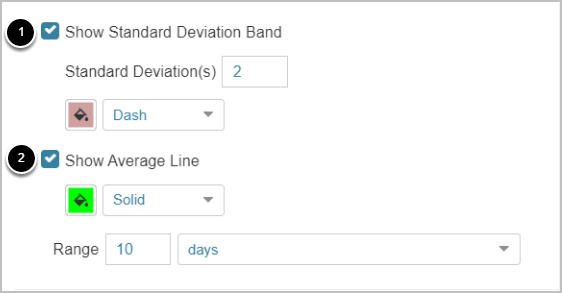
- Specify if you want to Show Standard Deviation Band. If yes, define the following settings:
- Specify a number of Standard Deviations
- Customize the line
- Specify if you want to Show Average Line. If yes, define the following settings:
- Customize the line
- Specify the range for counting the average value
4. Customize Height and Spacing

Optionally, customize the height of a single chart and spacing them
5. Define Additional Configurations
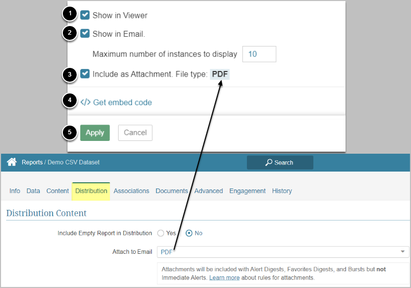
- Specify if you want to show the Visualization in Report Viewer
- Specify if you want to include the Visualization in an email and how many unique combinations of Metrics to show.
- Be mindful about your choice, since setting large numbers can affect email generation and delivery times.
- Specify if you want the Visualization to be included in attachments with Alert Digests, Favorites, and Bursts.
- File type can be configured on the Distribution tab.
- Get embed code for embedding the Visualization in custom web pages
- [Apply]
6. Verify the Result
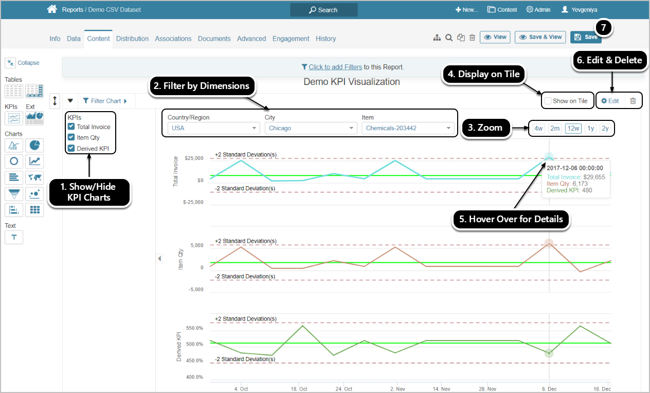
Here's an example of a KPI Visualization according to the settings above.
NOTE: By default, the Visualization shows data aggregated by sum.
From the Visualization Viewer, you can:
- Show/Hide a chart by using the corresponding checkbox
- Filter data display by using Dimensions
- Zoom in/out the display of data by using the available time intervals
- Show/Hide the Visualization on the Report Tile
- Hover over any point on the line to show more details
- Edit or delete the Visualization
- [Save] the changes
