In Metric Insights, the User can add different charts to the Dataset Report using the Content tab functionalities. They allow for better data presentation that will serve a wider range of User needs.
Available charting options include:
This list can be extended to include custom charts. For details, refer to Adding Custom Charts to Dataset Reports article.
Adding a Chart
It is as simple as drag-and-dropping the necessary chart icon to the page.
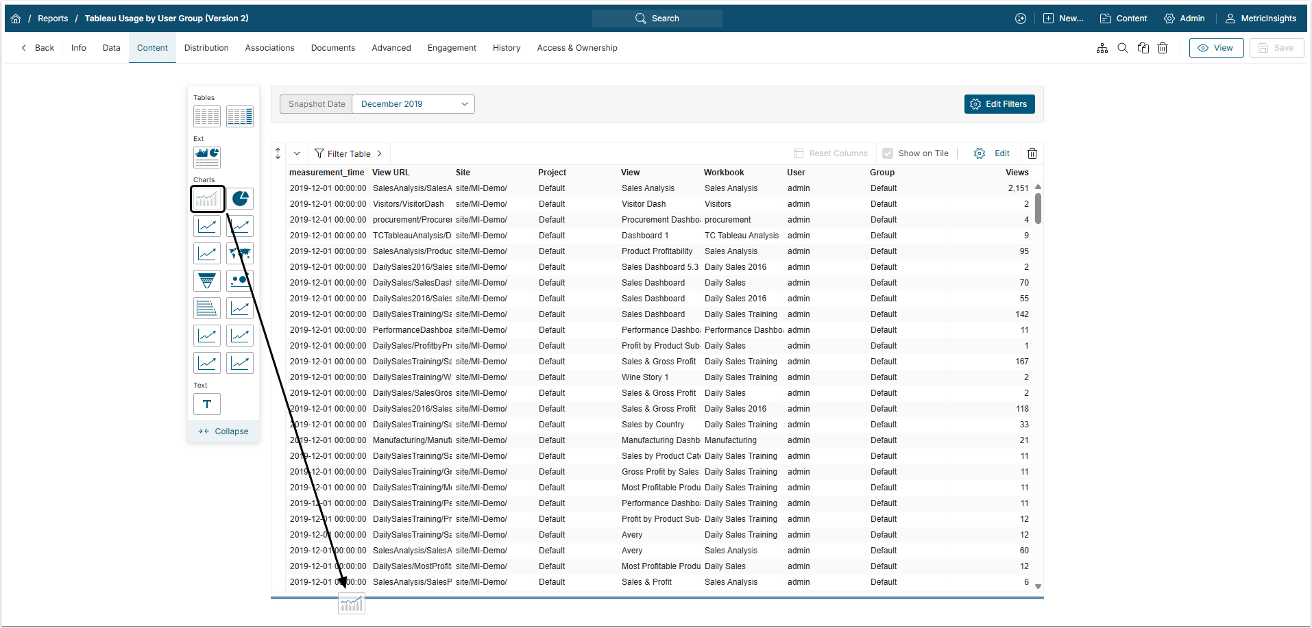
The Chart Editor will open automatically to the right.
Once the Chart has been added, you can pre-filter its data.
Filtering Chart Data
For better and more precise control over data visualization, you can add Chart Filters.
This can be done after the Chart has been displayed for viewing.
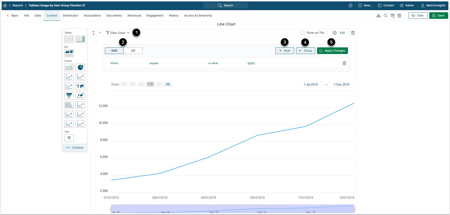
- Click [Filter Chart] to open the filters section.
- Select the Operator AND|OR that will be used to filter data.
- Add a Rule by clicking [+Rule].
- To add a Group of Rules, click [+Group].
- [Apply Changes] to see the result.
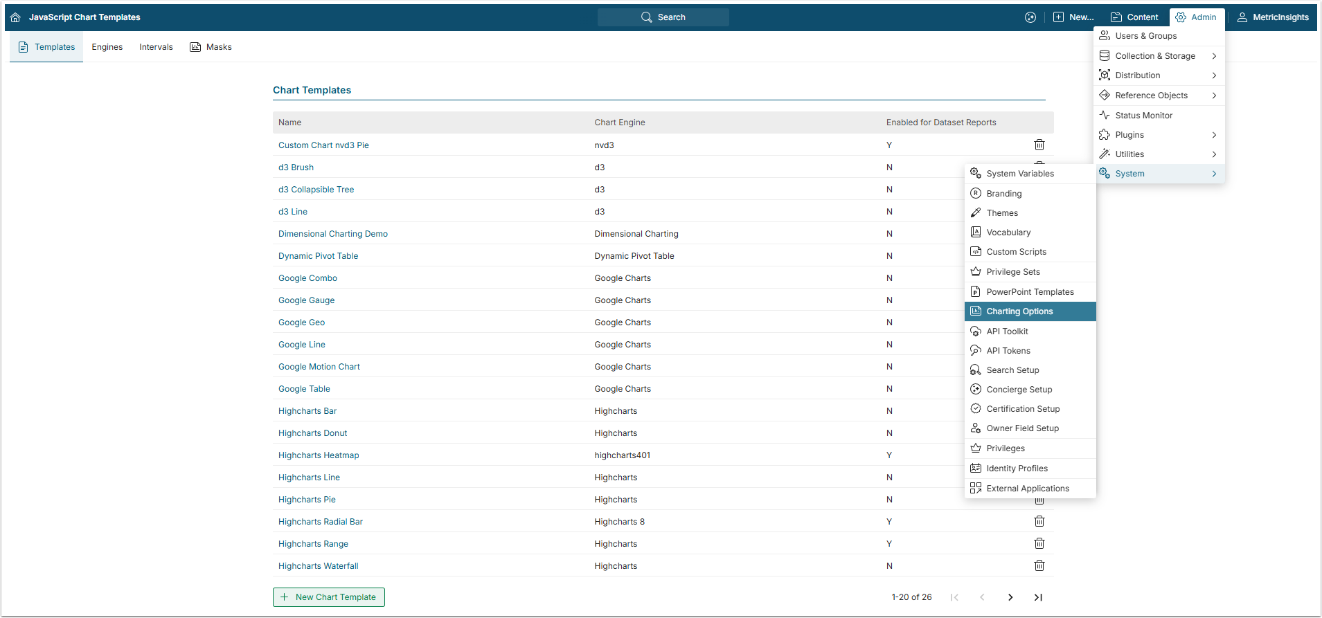
Change the Charts' Default Display Options
Users can modify the appearance of their Charts (colors, line width, bar shape, etc.) from the Chart Template Editor.
Access Admin > Charting Options and select the template.
For details, refer to Use Themes to Customize Metric Insights.
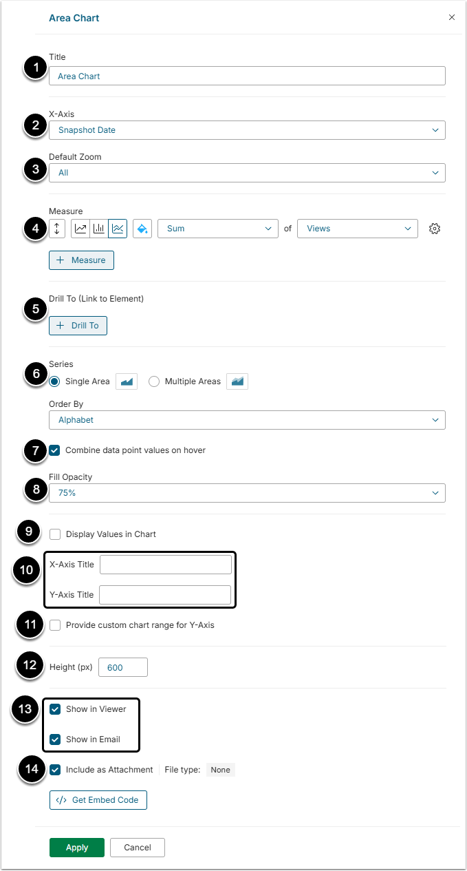
- Title: Specify the Name of your Line/Area Chart.
- X-Axis: Define which measurement values will be displayed on the X-axis.
- Default Zoom: If applicable, choose a relevant date zoom option (a month, three months, half a year, year-to-date, a year, or all).
- Measure: Choose the type of Chart (Line/Area) by clicking the respective tile; from the dropdown, select the type of aggregation and the column whose values will be aggregated. Also, choose the color for the measure. It is possible to mix line, bar, and area types of charts in one chart.
- If there are several measures, the Stacking control appears. It defines how different measures will overlap on the chart.
- The order of the measures can be changed by dragging them with the up/down button.
- Drill To: Click the button to link your chart to another Metric Insights' Element.
- The link to the Element will instantly be displayed in the Chart Editor.
- Series: Select "Single" to make your Chart display a single Measure, and "Multiple" to show several Measures.
- By opting to have several Measures represented in your Chart, specify the additional Measure that will be shown on the Chart's X-axis.
- Combine data points values on hover: Activate to combine data points values into one tooltip.
- Fill Opacity: Define the opacity of filling color in the area chart measures.
- Display Values in Chart: Activate this checkbox to display values in the chart.
- X-Axis / Y-Axis Title: To display some specific titles for the axis, type them into these fields.
- Provide custom chart range for Y-Axis: Select this checkbox to set a Chart Range for the Y-axis and open the Minimum and Max value fields for input.
- Height: Define the height of the chart in pixels.
- Select where the chart will be shown.
- Include as Attachment: Activate this checkbox to add this chart as an attached file to the report.
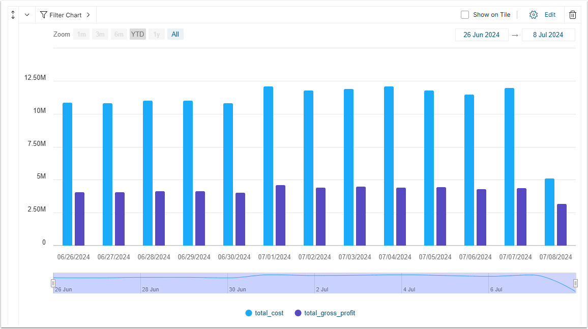
If the Stacking is set to "None", the measures are placed on the chart independently. In area charts they overlap with each other and in the bar charts they are places besides.
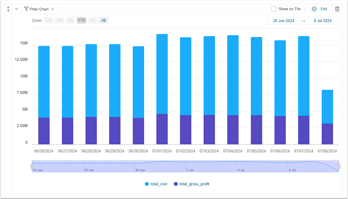
When the Stacking is set to "Normal", the measures are placed one atop of another.
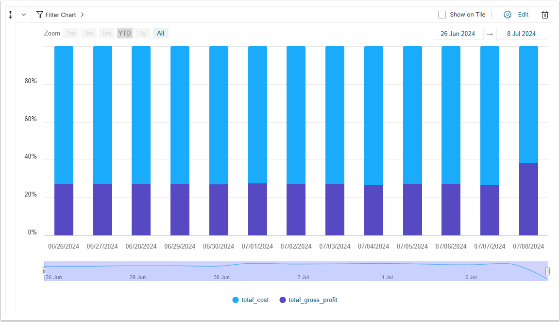
When the Stacking is set to "Percent", the measures are shown as percentage of one to another.
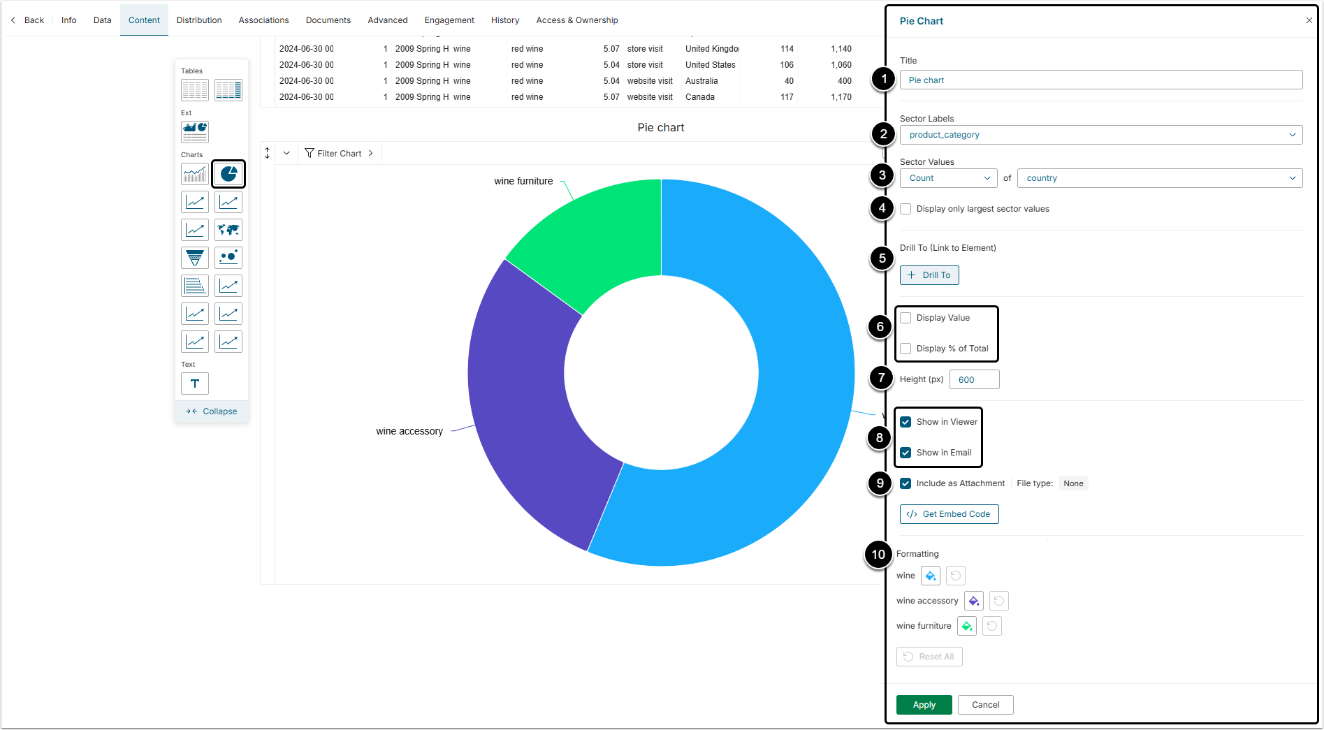
- Title: Specify the name of your Pie Chart.
- Sector Labels: Define which measurement values will be displayed by the Pie Chart sectors.
- Sector Values: From the dropdown menu select the type of aggregation and the column whose values will be aggregated.
- Display only largest sector values: Select this checkbox to make the chart less specific. Activating this checkbox will also allow you to choose the number of top sectors to show and define how to name the sector that will aggregate all other sectors.
- Drill To: Click the button to link your chart to another Metric Insights' Element.
- The link to the element will instantly be displayed in the Chart Editor.
- Select the Chart to show Display Values and/or Display % of Total.
- Height: Define the height of the chart in pixels.
- Select these to make the chart visible in Viewer and Email.
- Include as Attachment: Select this checkbox to add this chart as an attachment file.
- Formatting: Here you can choose the color of every chart sector.
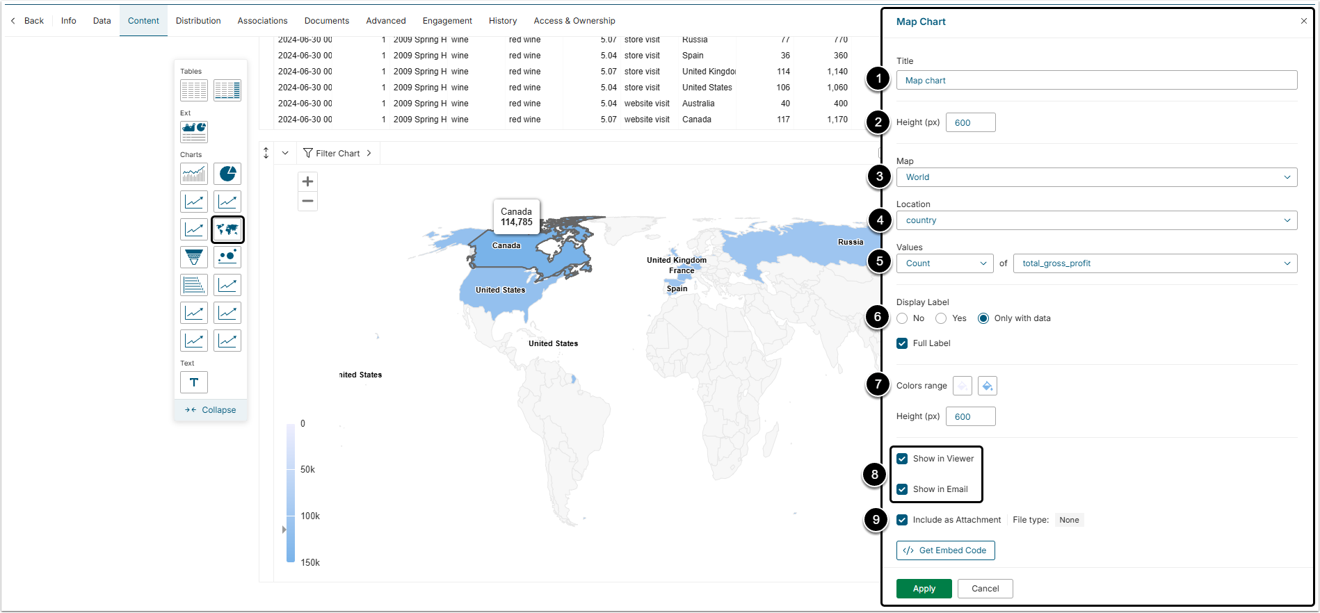
- Title: Specify the name of your Map Chart.
- Height: Define the height of the chart in pixels.
- Map: Choose the type of map that will be displayed.
- Location: Select the data column containing relevant country names or world region names.
- Values: Select the type of aggregation and the column whose values will be aggregated.
- Display Label: Determine how the labels on map have to look like, if there will be any.
- Colors range: Select colors in which the countries will be highlighted.
- Select these to make the chart visible in Viewer and Email.
- Include as Attachment: Select this checkbox to add this chart as an attachment file.
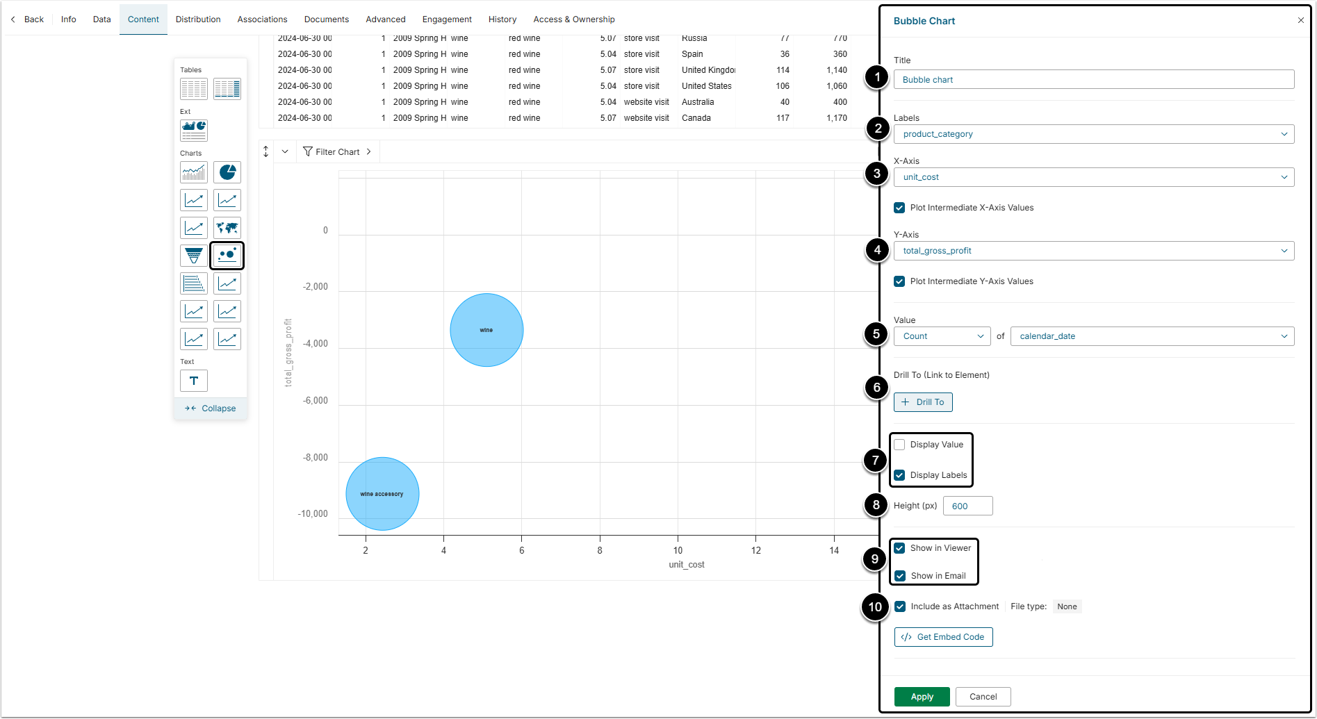
- Title: Specify the name of your Bubble Chart.
- Labels: Select which Column Values will be displayed as Labels on the Chart Bubbles.
- X-Axis: Define the Measure whose values will be displayed on the X-axis.
- Y-Axis: Define the Measure whose values will be displayed on the Y-axis.
- Value: Select the type of aggregation and the column whose values will be aggregated.
- Drill To: Click the button to link your chart to another Metric Insights' Element.
- The link to the Element will instantly be displayed in the Chart Editor.
- Display Value/Display Labels: Determine if and how you want your Bubble Chart to show Values and/or Labels.
- Height: Define the height of the chart in pixels.
- Select these to make the chart visible in Viewer and Email.
- Include as Attachment: Select this checkbox to add this chart as an attachment file.
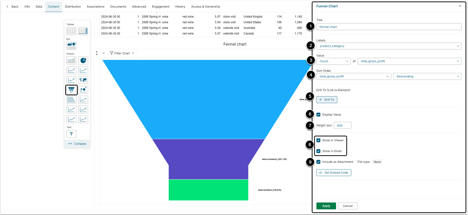
- Title: Specify the name of your Funnel Chart.
- Labels: Select which Column Values will be displayed as Labels on the Funnel Chart.
- Value: Select the type of aggregation and the column whose values will be aggregated.
- Sort Order: Specify the Measure whose values will be sorted and determine the sorting order (Ascending or Descending).
- Drill To: optionally, click the button to link your chart to another Metric Insights' Element.
- The link to the Element will instantly be displayed in the Chart Editor.
- Display Value: Deselect the box if you do not want measurement values to appear on the Chart.
- Height: Define the height of the chart in pixels.
- Select these to make the chart visible in Viewer and Email.
- Include as Attachment: Select this checkbox to add this chart as an attachment file.
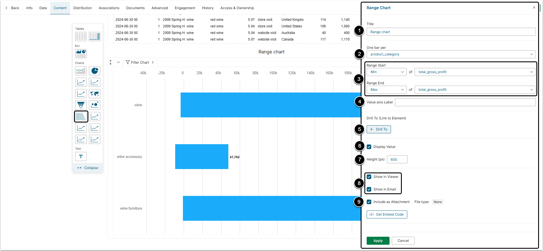
- Title: Specify the name of your Funnel Chart.
- One bar per: Define which Measure each Chart bar will represent.
- Range Start / End: Determine the Start and End Values for your Range Chart.
- Value Axis Label:If needed, label the Axis that displays Measure Values.
- Drill To:Click the button to link your chart to another Metric Insights' Element.
- The link to the Element will instantly be displayed in the Chart Editor.
- Display Value:Deselect the box if you do not want measurement values to appear on the Chart.
- Height: Define the height of the chart in pixels.
- Select these to make the chart visible in Viewer and Email.
- Include as Attachment: Select this checkbox to add this chart as an attachment file.