This article gives a brief overview of the range of expanded Reporting options available in Metric Insights.
The Dataset Report Editor has following tabs:
1. Info Tab
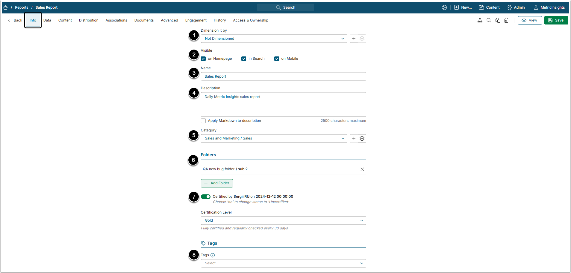
- Dimension it by: Optional. Choose a Dimension to be applied to the Report.
- Visible: Select where the Report will be visible by activating the corresponding checkbox.
- Name: Give the Report a descriptive name.
- Description: Optional. By default, the Name is repeated here, but if this is not sufficiently descriptive, you may change it.
- Category: Select from dropdown; all reports much exist in one and only one Category.
- Folders: By clicking [+Add Folder] the User can include this Report into one or several Folders.
- Certified: Certification is a means for Admin and Power Users to identify Elements that have been approved as being valid and accurate. For details refer to Certifying an Element.
- Tags: Tags are used to relate Elements to each other for purposes of identifying similar Charts when the See Related drop-down list in the Metric Viewer is populated, allowing a more in-depth analysis of trends. For details refer to Create a Tag.
2. Data Tab
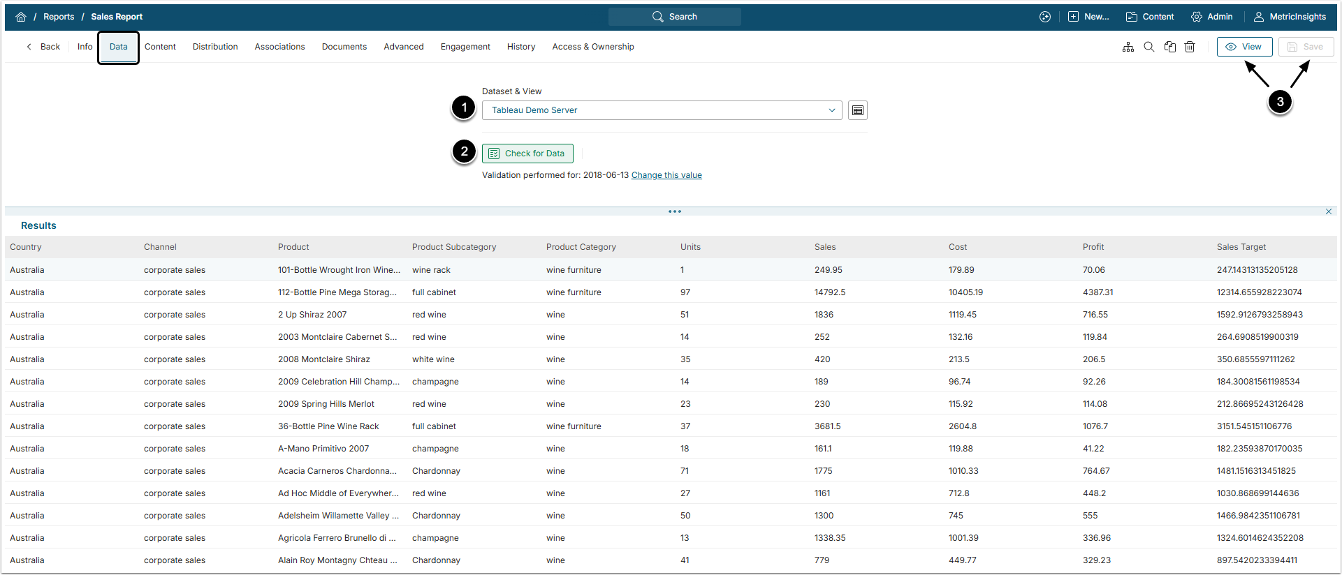
- Dataset & View: Select the Dataset from the drop-down menu.
- [Check for Data] to validate the report.
- [View] or just [Save].
Your Report is now ready to view, but you will probably want to apply some of the Report Formatting options available in the Report Content tab.
3. Content Tab
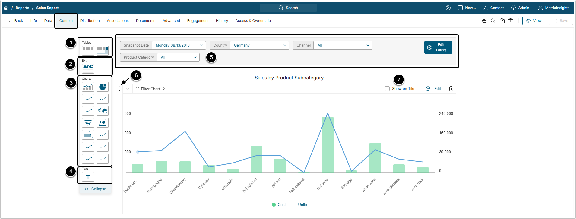
- Drag-and-drop Tables or Pivot Tables to the bottom of the page to add it to Report.
- For more details, check Creating Pivot Tables in Dataset Reports, Using Sections and Groups in Dataset Report Tables and Adding Column Aggregation to Dataset Report Tables articles.
- Drag-and-drop External Visualization to the bottom of the page to add it to Report.
- For more information, see the Adding External Report Visualization to Dataset Report article.
- A variety of pre-formatted Charts are also available.
- Fir more information, check Creating Charts in Dataset Reports and Adding Custom Charts to Dataset Reports articles.
- Drag-and-drop Text to the bottom of the page to add it to Report.
- For more details on Text Blocks, see Working with Text Blocks article.
- Those are filters, applied at the Report or Element level. For more details, see Applying Filters in Dataset Reports article.
- The up-down icon allows you to move the various items within the Report.
- Specify which Chart or Table will appear on the Homepage tile by activating the Show on Tile option. Only one object will be allowed, any other checkbox will be de-selected.
4. Distribution Tab
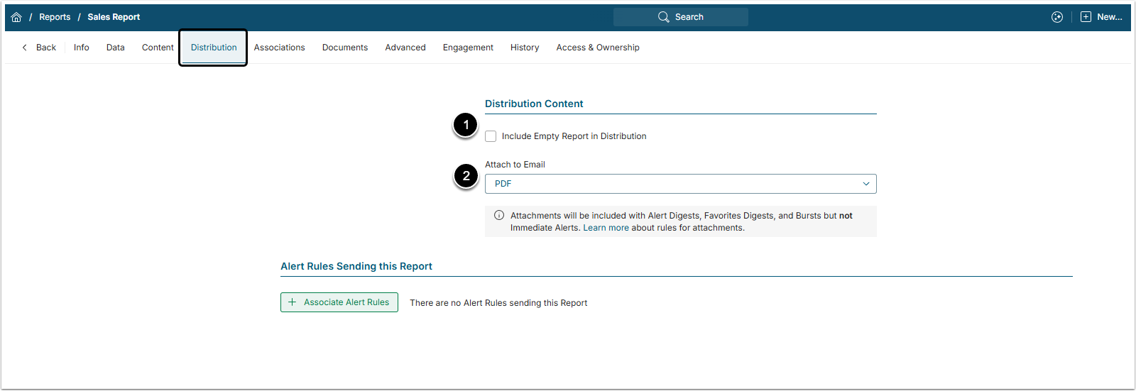
- Include Empty Report in Distribution: Specify whether Reports with no data will be distributed or not. For more details, see Generating Empty Dataset Reports.
- Attach to Email: If you have chosen to include any attachments to your Report, you must specify the format here.
NOTE: This setting will apply to all Charts and Tables electing to include attachments.
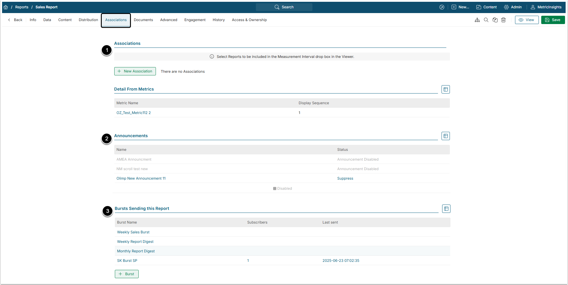
5. Associations Tab
-
Associations: These are the drill path that lead from the Metrics.
- For more details, check Establishing a Drill-Path from a Metric to Another Element article.
-
Announcements: This table shows the list of Announcements that is shown on the Report Viewer.
- For more information, see Create an Announcement on Homepage or Element Viewer article.
- Bursts Sending this Report: The Dataset Report can be sent to other users via Burst. This table shows the list of Bursts that include this Report.
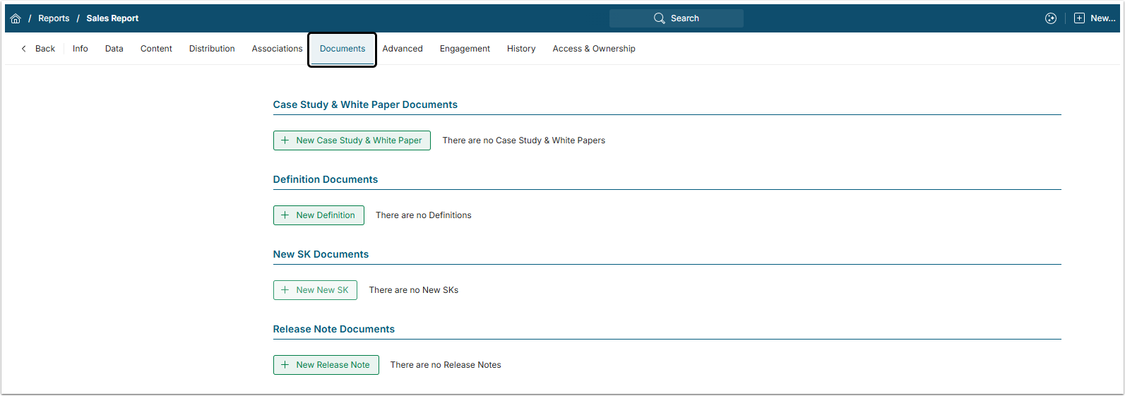
6. Documents Tab
In this tab the User can attach Documents to the Report. For more details, check the Adding Documents to Homepage or Element Viewers article.
7. Advanced Tab
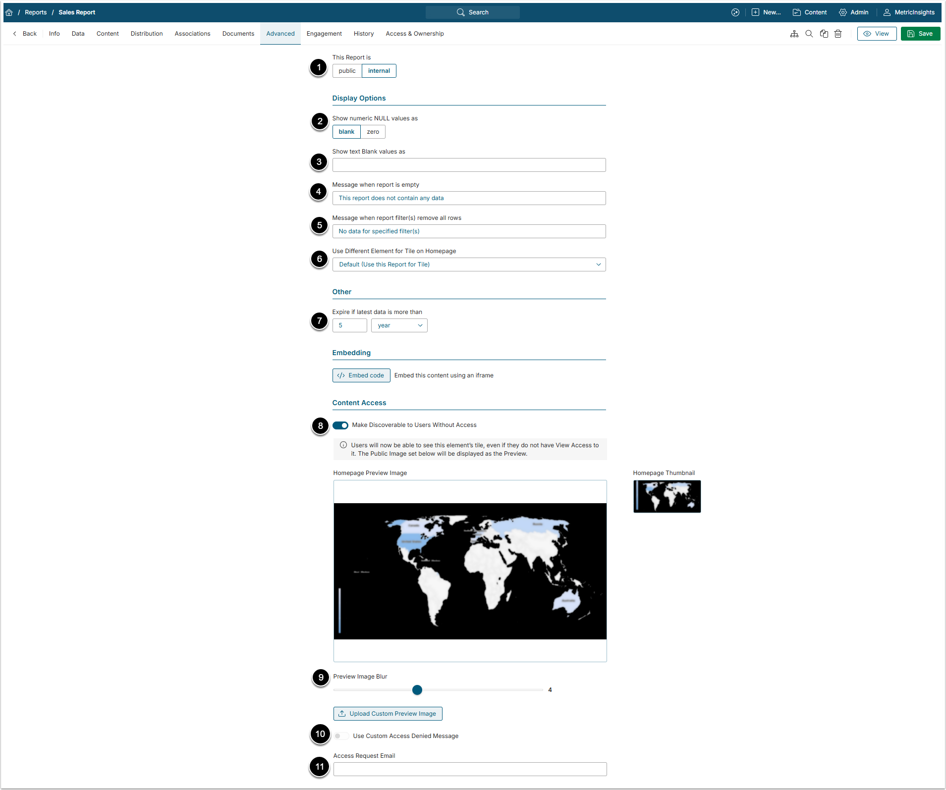
- This Report is: Define whether this Dataset Report will be visible to all Users that have access to it or only to you.
- Show numeric NULL values as: Define either the NULL values will be shown as a blank space or a zero.
- Show text Blank values as: Provide a custom text to replace a blank text value if necessary.
- Message when report is empty: If the Report is empty, the message from this field is shown.
- Message when report filter(s) remove all rows: The message provided here will be shown to the User if after applying Filters there will be no data to show.
- Use Different Element for Tile on Homepage: Select what Element is shown on the Catalog Page Tile of this Report.
- Expire if latest data is more than: Set the time period after which the Report is expired.
- Make Discoverable to Users Without Access: Define whether the Users who don't have access to this Report can see it blurred on the Catalog Page or not. If it is visible, the User can request access by clicking on the Report's Tile.
- Preview Image Blur: Define how blurred the Preview image will be for Users who don't have access to the Report.
- Use Custom Access Denied Message: Enable this toggle switch to add a custom "Access Denied" message for Users who try to open this Report without having access to it.
- Access Request Email: Provide an email address to which access requests will be sent.
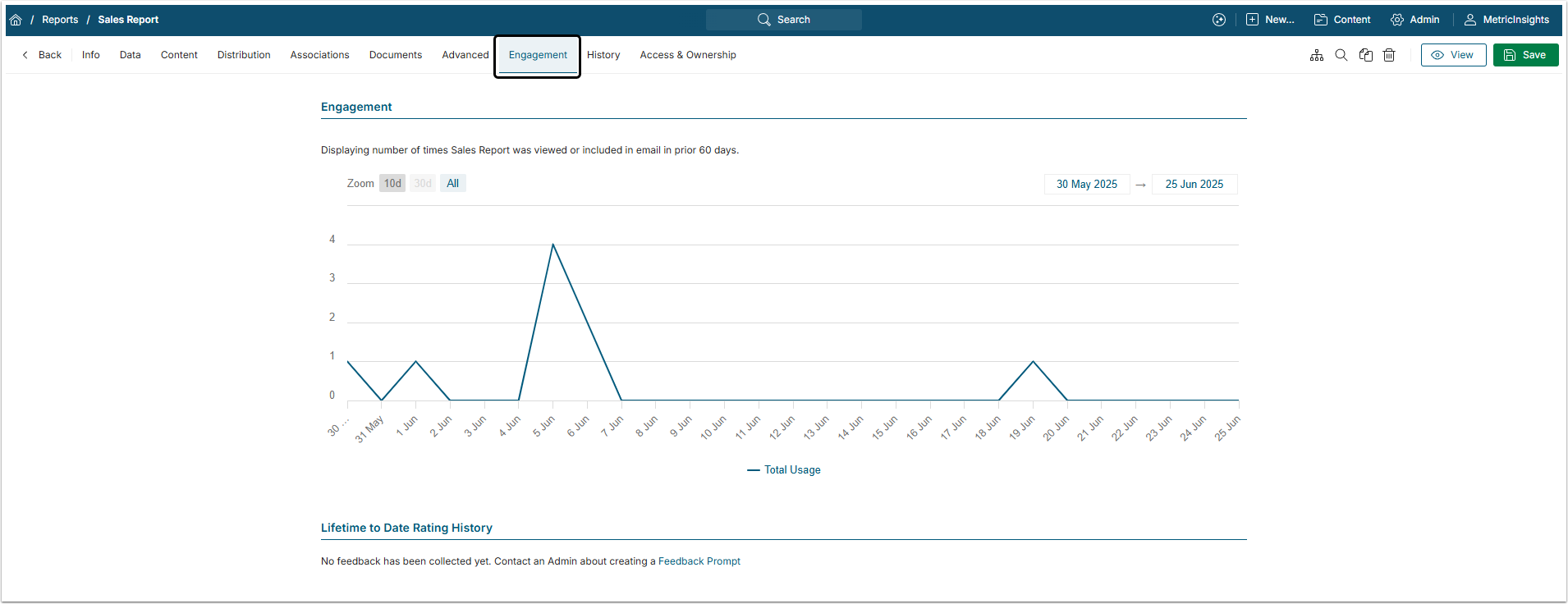
8. Engagement Tab
This tab shows all the engagement that Users had with this Report. The chart displays how many times Users opened the Report's Viewer. The Feedback section shows comments Users left to this Report.
9. Access & Ownership Tab
This tab shows all the Users and Groups that have access to the Report.
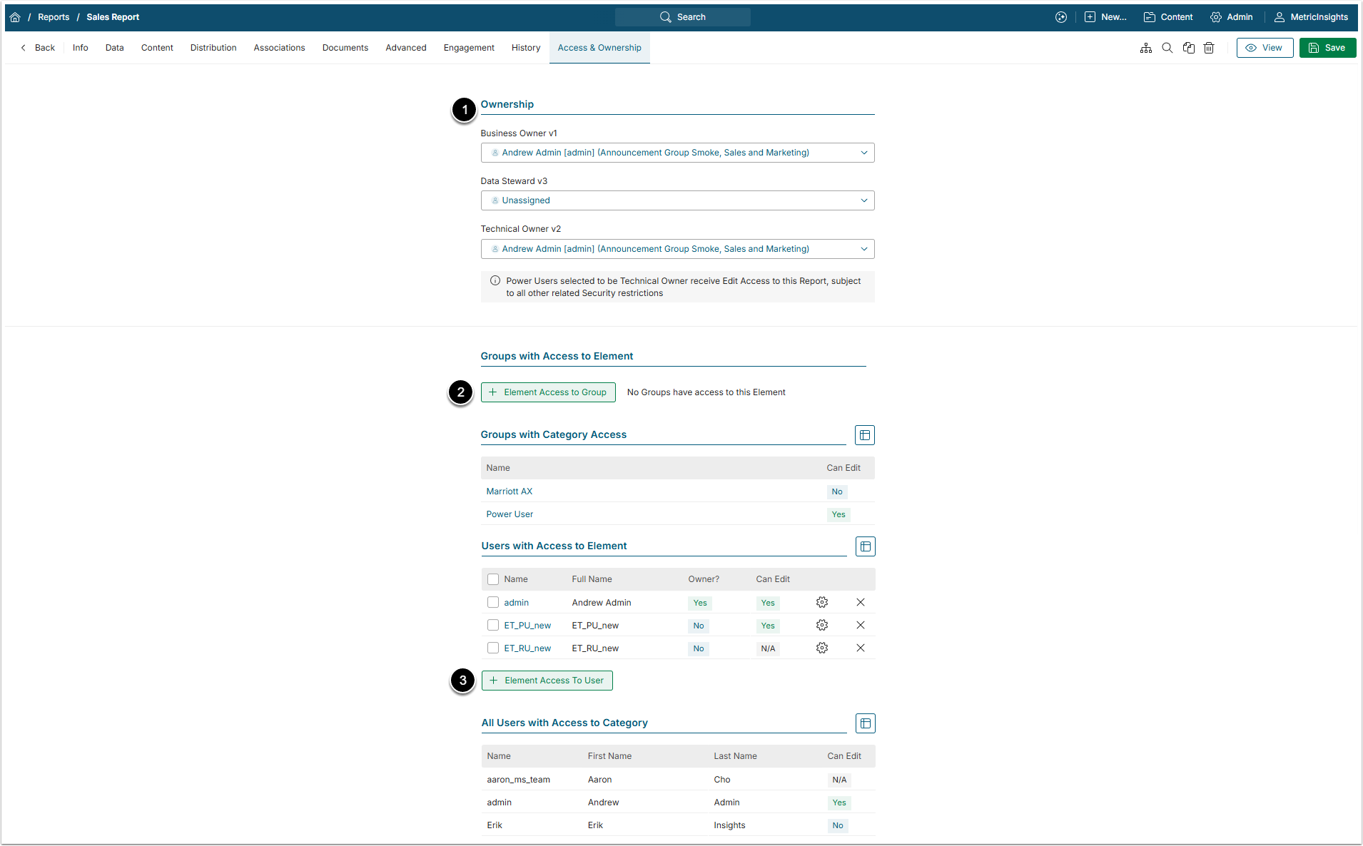
-
Ownership: In this section the Administrator or creator of the Report can define who will be owners of the Report.
- For more information, see What Types of Users Exist in Metric Insights article.
-
Groups with Access to Element: This section shows Groups of Users that have access to the Report and allows to grant access to new Groups.
- For more details, check the Assigning Privileges and Permissions to the Group article.
-
Users with Access to Element: This section shows individual Users that have access to the Report and allows to grant access to new Users.
- For more details, check the Granting Power User Access to the Report article.